1. Abstract
A set of five different regression models were tested as measures of Expected Points, parallelling prior work in the field (Clement 2019) - the Multi-Layer Perceptron, Stochastic Gradient Descent, Elastic Net, Ada Boost, and Bayesian Ridge models. The model outputs were viewed and compared to the results of the raw data, and calibration graphs for each model were developed, as well as calibration graphs broken down by down, quarter, and home/away. The Multi-Layer Perceptron proved the only effective model, with the Elastic Net and Bayesian Ridge models effective only in certain limited circumstances, the Ada Boost is of very limited use, and the Stochastic Gradient Descent proved completely useless as a predictor of Expected Points.
2. Introduction
The development of an EP model can proceed by two different approaches. The first, already seen, is to use a classification approach to determine the probabilities of each possible scoring play, and then map those probabilities to the values of each of those scores. This requires each probability to be calculated either one-vs.-one one-vs.-all, and is slow to fit. Furthermore, one cannot determine beforehand whether this additional step will help the model’s accuracy or not. This approach was used in a previous work (Clement 2019), to generally good results. This work seeks to determine whether similar or better results can be obtained by regression models, which are far faster to fit and simpler to interpret.
3. Methods
The data come from the existing Passes & Patterns, with games from 2002-2018 (Clement 2018b), and parsed to create a hierarchical object-oriented database (Clement 2018e). The determination of the next scoring play is as described in the work on classification models (Clement 2019), but in order to create a regression model this was first converted into the numerical value of the scoring play before being fed into the model, in accordance with Table 1 below. 10-fold cross-validation was used, with each play’s output being assigned to an attribute of that play, in order to avoid overfitting. In order to create the output graphs in section 4 the results of every play with a given down, distance, and yardline combination were averaged, in order to properly account for slight differences in the different k-folds. Gaps in the data were determined by predicting them on a model trained using the entire dataset. The calibration graphs were made by binning predicted EP values to the nearest tenth of a point, and averaging the true next scores. The error bars in all cases were determined by bootstrapping. All graphs were created through the use of the matplotlib library (Hunter 2007).
a. Feature Selection
As the mission of this work is to test the efficacy of several different regression models, the same feature selection has been used here as was used in the prior work (Clement 2019). The intent is to provide a simple initial test, thus the data has not been normalized in any way, it is presented to the model as-is, with the understanding that some of the models would benefit from a degree of data standardization. The matter of such data manipulation, however, is not a straightforward one, having already been discussed in some detail (Clement 2019), largely focussing on the issue of the data being measured in different units, as it were, as well as being non-normally distributed.
i. Down (0-3)
While down might more properly be considered a categorical variable, sklearn does not support categorical variables. For a first approximation down will have to be modeled as a continuous variable. Certain models here have the ability to treat down pseudo-categorically because of the way they operate. Down ranges from 0 to 3, with 0 down being used as a placeholder for kickoffs and PATs.
ii. Distance (1-109)
The distance to gain is a continuous feature of any positive integer up to, theoretically, 109. Realistically this is limited to 25 in most cases, usually 10 or less, but there are exceptional cases of 50 or more.
iii. Field Position (1-109)
While field position and distance have the same valid range, field position is far more evenly distributed. Though points nearer the middle of the field are more common, we see no shortage of instances at any given field position.
iv. EP Input
Whereas the previous work with classification models predicted class probabilities which could then be converted to EP predictions, this work uses the score values directly as numerical inputs. The score inputs are derived from the adjusted nominal values, repeated iteratively until the values converge beyond the 10-16 level. The following score values are attributed, along with their bootstrapped 95% confidence intervals.
Table 1 Score values with confidence intervals
These values differ from those found in the classification-based work because of ongoing improvements in the database regarding bookkeeping errors, an ongoing process due to the inconsistent rigour in the scorekeeping. A particular problem is an inconsistency in labelling the change in possession after a defensive touchdown
b. Model Selection
Of the models used for classification, the logistic regression model simply cannot be applied to regression problems, while the k-nearest neighbours, random forest, and gradient boosting models all return the same results when used in regression mode, without the intermediate step of calculating score probabilities before mapping them to score values to get an EP value. Thus, only the multi-layer perceptron model could be reused in regression mode to get a direct comparison between models. Instead, a different set of models were chosen, based on the recommendations of the sklearn cheat sheet (Pedregosa et al. 2011). The support vector machine was excluded because the dataset is sufficiently large to make the fit times unmanageably long. For consistency of code, and because it is the premier machine learning library for Python, model selection was limited to models within sklearn.
The models chosen are intended to represent a series of different approaches to the problem, even if all of the models are variations of linear approaches there are still great variations in methods that lead to differing results. While a complete examination of all the different algorithms even just within sklearn would be nigh-impossible, this provides a reasonable sampling of different popular approaches that are similar to many of the available methods.
Methods within this Passes & Patterns code were also preserved. K-fold cross validation, with k=10, was used to predict the EP of each play, and these values were assigned to the play objects. Rather than determining the individual probabilities of future scoring plays, the input for the training data is the value of the next scoring play, as adjusted for knock-on effects (Clement 2019).
The same style of correlation graph is used here as in the previous work, and largely the same analysis will be performed, looking at the predicted EP against the true EP of each model, and further breaking down the models by quarter, down and home/away to identify possible biases. The heatmap graphs are the same as in the previous work, with the notable change of the colour scheme. rainbow was formerly used, this has been changed to viridis (Bob Rudis and Garnier 2018) for improved accessibility, as viridis is perceptually uniform and robust to colourblindness. Certain changes to the graphs for basic formatting have also been made, but their fundamental nature remains intact and comparisons between the two are straightforward, while the correlation coefficients R2 and RMSE are directly comparable.
i. Multi-Layer Perceptron (MLP)
This model comes from sklearn.neural_network.MLPRegressor, (Pedregosa et al. 2011) whose classification equivalent was a strong performer, albeit one that was very slow to train, likely due to the oversized network in use. The regression model is much faster to train, and MLP models are also well-adapted to warm starts, drastically decreasing training time after the first k-fold. While MLPs can be very powerful models, they are unfortunately rather inscrutable, with the underlying model consisting of a large number of hidden nodes, with a logical path that cannot be reasonably be traced by hand. Nonetheless, this model has a strong past as a class predictor for both EP and field goals can hopefully provide similar results.
ii. SGD Regressor (SGD)
From sklearn.linear_model.SGDRegressor, this model is known for its strength in sparse problems (Pedregosa et al. 2011), which is important in unusual distance and yardline combinations for 2nd and 3rd downs, that being the area where the raw data itself cannot be used directly. Furthermore, the model scales well with large datasets and large numbers of features. Although EP uses few features, There are over 200,000 records, and so efficient scaling is a valuable attribute for a model. SGD is sensitive to feature scaling, but the features in this model are not scaled, both to maintain the simplicity of the scope of work, and also because the question of how to scale features is uncertain, and has been previously discussed (Clement 2019). Table 2 gives the coefficients and intercepts for the output of the SGD model.
Table 2 Coefficients and Intercepts for SGD Model
From Table 2 we see that this model favours down as the strongest predictor of EP. In an unregularized context down is unsurprising to see as the most weighted feature, but these values seem somewhat odd, with field position being more valuable than distance to gain by a factor of 16, despite the narrower domain. Granted, these coefficients are not pure measures of feature importance, and so to compare the coefficients in this way is, at best, a heuristic.
iii. ElasticNet (Elastic)
From sklearn.linear_model.ElasticNet (Pedregosa et al. 2011), the Elastic model is a linear regression that blends the Lasso and Ridge models, using both L1 and L2 regularization to handle both sparse learning and regularization. Table 3 gives the coefficients of the features.
Table 3 Coefficients and Intercepts for Elastic Model
As seen in Table 3, the Elastic model looks to 0 the coefficients of features where possible. While we consider it dubious in this case that down and distance can simply be handwaved away and EP can be reduced to a function of field position as anything more than a first approximation, the model shall be allowed to stand, or fall, for itself.
iv. Ada Boost Regressor (Ada)
The Ada Boost Regressor (Pedregosa et al. 2011) is a form of ensemble model from sklearn.ensemble.AdaBoostRegressor that applies error-adjusted weighting at each iteration to provide progressively better results across each iteration. The Ada model is conceptually similar to other boosted ensemble models, such as the Gradient Boosting Classifier previously seen. As with previous ensemble models, 1000 estimators were used. In Table 4 we have the relative feature importances for the Ada model.
Table 4 Feature Importances for Ada Model
While the primacy of field position is unsurprising in Table 4. The degree to which it dominates the model is, as is the near-complete eradication of distance as a factor to be considered. While distance may indeed be considered the least important of the features, something that has been the general consensus across the various models both in this work and its predecessor (Clement 2019), it has never before been considered so vastly unimportant as this, where it is little more than a rounding error. The only comparison is the Elastic model, one which actively sought to remove features from consideration.
v. Bayesian Ridge (BR)
The BR model, from sklearn.linear_model.BayesianRidge (Pedregosa et al. 2011) is the first foray into a Bayesian approach, where we begin with a set of uninformative priors and develop the model “along the way,” as it were, tuning the regularization parameter as part of the model fitting. Other models generally treat these parameters as being pre-set, and modify the weights of the model to optimize the model precision. Table 5 gives the coefficients and intercept of the BR model.
Table 5 Coefficients and Intercepts for Bayesian Ridge Model
As is typical, Table 5 shows distance as being the least important feature. This model has down as the most heavily weighted feature, though that is still likely a product of non-normalized domains of the data. These values are similar to an order-of-magnitude level to the coefficients of the SGD model, despite their vastly different approaches.
4. Results
In order to fully examine the models, the analysis of the model output has been separated from the evaluation of their performance based on their correlation with reality. While correlation is evaluated based on a number of different axes, looking at down, quarter, and home-away, the model results can only really be effectively visualized when separated by down. Thus each down is looked at separately in the sections below, and within each down the raw results are first evaluated, and then each model in turn.
a. 1st Down
1st Down differs from 2nd and 3rd down in that nearly all plays have a distance of 10 yards. While penalties can create distances of (usually) 5 or 15 yards, these are relatively uncommon compared to 1st & 10. A notable exception is near the goal line, where instead of 1st & 10 we see 1st & goal, and the distance to gain is equal to the yardline. Because of this we are only looking at 1st & 10/1st & goal in the following sections, and omitting any visualizations of other distances. Removing one of the dimensions means that the data can easily be plotted on a two-dimensional plot, and this allows for the inclusion of error bars. The error bars created here are the product of bootstrapping the outcomes from all the 1st & 10 plays at each yardline.
A brief note about the methodology for the models: as with the classification work, the k-fold cross-validation means that the predicted EP for each play comes from the predictions of a model fitted against other data. The predictions from all plays are then included and averaged. This approach was adopted to avoid issues of overfitting for data that lie at unusual combinations of distance and yardline that otherwise become overfitted.
Each model’s data on 1st & 10 was plotted, and a linear regression was applied to the results. The slope, intercept, and coefficients of each are given in Table 6 as a means of comparing the similarity of the different models.
Table 6 Fitted Lines and Coefficients for 1st & 10 Results
A cursory glance at the various parameters of the linear fits to the different models is immediately telling. The MLP model is a near-exact match to the raw data, whereas the SGD model seems to have been derived from completely unrelated data. The other models seem to have varying degrees of similarity to the raw data. It should never be forgotten that for 1st down, and for 1st down only, that we hope to have as exact a match as possible to the raw data, as the confidence intervals are very narrow for the raw data here. For other downs a more smoothed effect is preferable, as the data is much sparser.
i. Raw
The use of raw data versus model-derived results is a quintessential question in data science. It is the opinion of the author that where sufficient data exists the data scientist should stay as close to the raw numbers as possible. In football we have a large state-space for EP, but the data is unevenly distributed. A majority of all plays are 1st & 10, and these are only distributed over the 110 yards of the field (of which there are only 109 possible ball placements). Therefore it is reasonable here to use the raw data, as shown in Figure 1. The error bars shown are bootstrapped from the list of all future scoring outcomes from the given situation, using 1000 bootstrap iterations, and show the two-sided 95% confidence interval.

Figure 1 EP for 1st & 10 by Yardline, Raw Data
Raw EP shown in Figure 1 is linear with respect to field position, except at the extremes of the field. This is consistent not just with the previous work (Clement 2019), but also with all previous examinations of EP in American football, both at the NFL and NCAA level (Clement 2018a). The point at 1st & Goal at the 5-yard line continues to baffle, as EP is far lower at this point than any of its neighbours. It is possible that some of this is caused by mislabelled 2-point conversions in the data being listed as 1st down instead of 0th down, but such instances that escaped detection during the various data cleanup projects would be sufficiently rare that this seems unlikely. The fitted line should not be taken as a substitute for the raw values, as the true data is not linear at the edges and this influences the intercept of the line, bringing it higher than it should be, as the data points at either extreme of the field are above the fitted line. However, the value of the fitted line is in its slope, we can assess the EP value of a marginal yard, which here is 0.0643 EP/yd, or 1/17 EP/yd as an approximation. Unfortunately 17 is not an easily divisible number but it can provide an effective heuristic for coaches to understand the value of field position in a more quantitative way.
Note also that certain data points have very small bootstrapped intervals, such as at the 75 yard line (-35 yard line in standard parlance), this is the point at which the ball is spotted after rouges and field goals where the defense elects not to receive a kickoff, and is also a common spot for kickoffs to be tackled. Thus there are a huge number of plays from this point, and the error on the point estimate shrinks as a result. A similar, but smaller, effect occurs at 90 yards (-20), as that is the spot after a touchback, and at the 1-yard line, as a result of penalties near the goal line. Note also that the point at the 75 yard line is well below the fitted line. This is likely attributed to teams starting after a rouge. Rouges have three sources: missed field goals, long kickoffs, and punts, either failed coffin corners or punts that go further than expected.. Field goal attempts and punts that have the potential to become rouges require the offense to move into opposition territory, a sign of an effective offense. Rouges from kickoffs generally imply that the kicking team scored, since otherwise they would only kickoff once per game. Thus each of these is a sign of a team whose offense is effective in advancing the ball, and correlate with winning. As a result, the team beginning on the -35 is usually less good than their opponent, and so will tend to score fewer points. A 1st & 10 on the -34 or -36 is NOT the result of a rouge, and so will be selected more-or-less randomly. In future analysis we should then consider two different scenarios for 1st & 10 at the -35 - whether or not this position is the result of a rouge or not. If not, we should interpolate between the adjacent yardlines to get a more accurate picture of the EP in this circumstance, or we should separate this into two EP values, whether from a rouge or not.
ii. MLP
Given that the parameters in Table 2 are a near-perfect match between the raw data and MLP model, expectations are high for the visual comparison. The MLP classification model was also an excellent EP model, so there is reason to believe that the regression equivalent will also be a strong performer
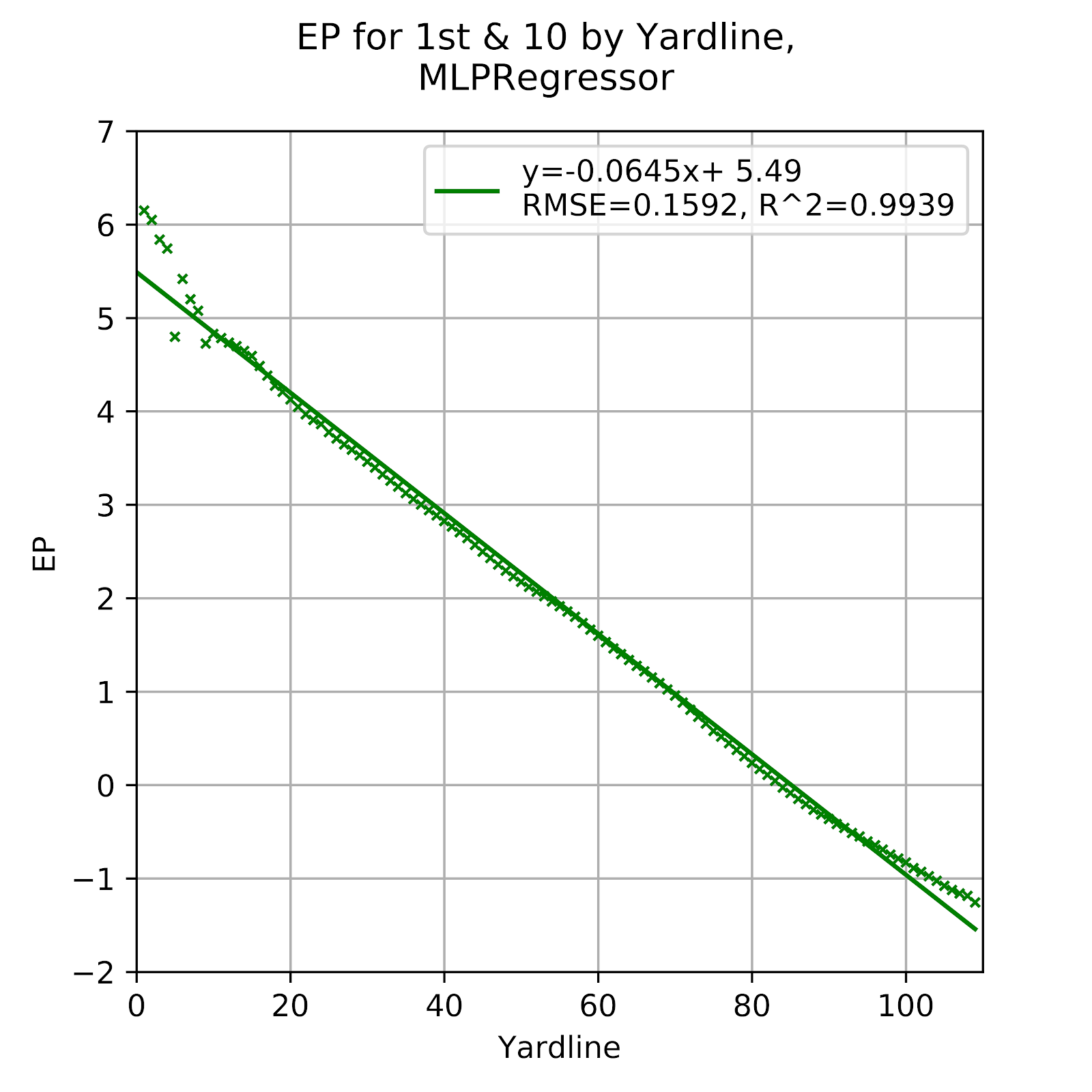
Figure 2 EP for 1st & 10 by Yardline, Multi-Layer Perceptron
As visible in Figure 2, the results of the MLP models are hyper-linearized, almost exactly following the trendline. This stands in sharp contrast to the classification model. The only non-linear aspects to the model are in & Goal situations, but the slight deviations from the trendline show that the model is doing more than simply connecting the dots over the middle portion of the data. In fact, this model may be the most effective to reduce the noise without oversimplifying the results.
iii. SGD
From the values in Table 2 there are immediate concerns about the SGD model. The slope is far shallower than the raw data, or any other model. Given the intercept, the EP at yardline=110 (the opposite goal line) would be ~-6 EP, a number which simply makes no sense, it essentially assumes that the opposing team is near-certain to score a touchdown next. A visual representation in Figure 3 offers the opportunity to confirm this suspicion.

Figure 3 EP for 1st & 10 by Yardline, Stochastic Gradient Descent
Figure 3 is as expected, and in fact the data goes literally off-the-chart at about the 70 yard line, since no previous 1st & 10 EP value had ever approached -2 EP, never mind -6 EP, the scale was thus not calibrated appropriately, or rather the model has clear issues, at least on 1st down. The SGD model clearly cannot be trusted in this situation, these results are entirely divorced from reality.
iv. Elastic
The Elastic models parameters in Table 2 are broadly similar to those of the raw data. While they do not parallel as closely as the MLP, they are certainly in a range that could be conceivably prove reasonable. Ultimately a closer inspection of the plots is required, and can be seen in Figure 4.
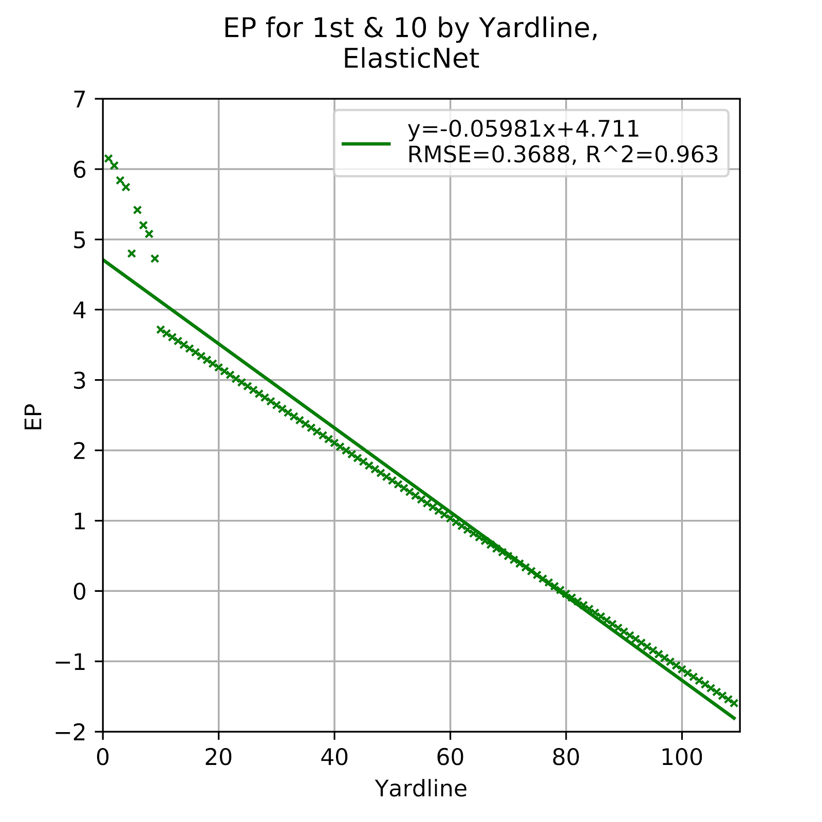
Figure 4 EP for 1st & 10 by Yardline, Elastic Net
As is fairly common, Figure 4 faithfully recreates the data for 1st & Goal, but thereafter simply follows a linear trend. This has been seen before from other linear-type models, and it unfortunately provides a weak approximation to the actual data, especially with the sudden drop in EP at the 10 yard line, and the lack of a tailing-off for data at higher yardlines.
v. Ada
From Table 2, the Ada model appeared to be the second-most similar to the raw data, after the MLP, although it was a distance second and nearer to the third- and fourth-place models. In Figure 5 we see the plotted results for the Ada model on 1st & 10 by yardline.

Figure 5 EP for 1st & 10 by Yardline, Ada Boost
While the big-picture parameters may paint the Ada model as a decent approximation of reality, taking even a cursory glance at the plotted data in Figure 5 exposes the model as pure, unadulterated garbage. The model correctly emulates the 1st & Goal data, then proceeds in seemingly arbitrary steps, with sections of completely flat EP, and at no point does it bear a resemblance to the data or its own trendline.
vi. BR
The BR model offers some hope for its novel approach compared to other models, which have mostly been variations on a theme, usually trees or linear models. While the parameters from Table 2 were not a perfect match, nor anything near it, they had enough of a resemblance to put the model in contention with the Ada and Elastic models. In Figure 6 we get a closer look at the BR data.
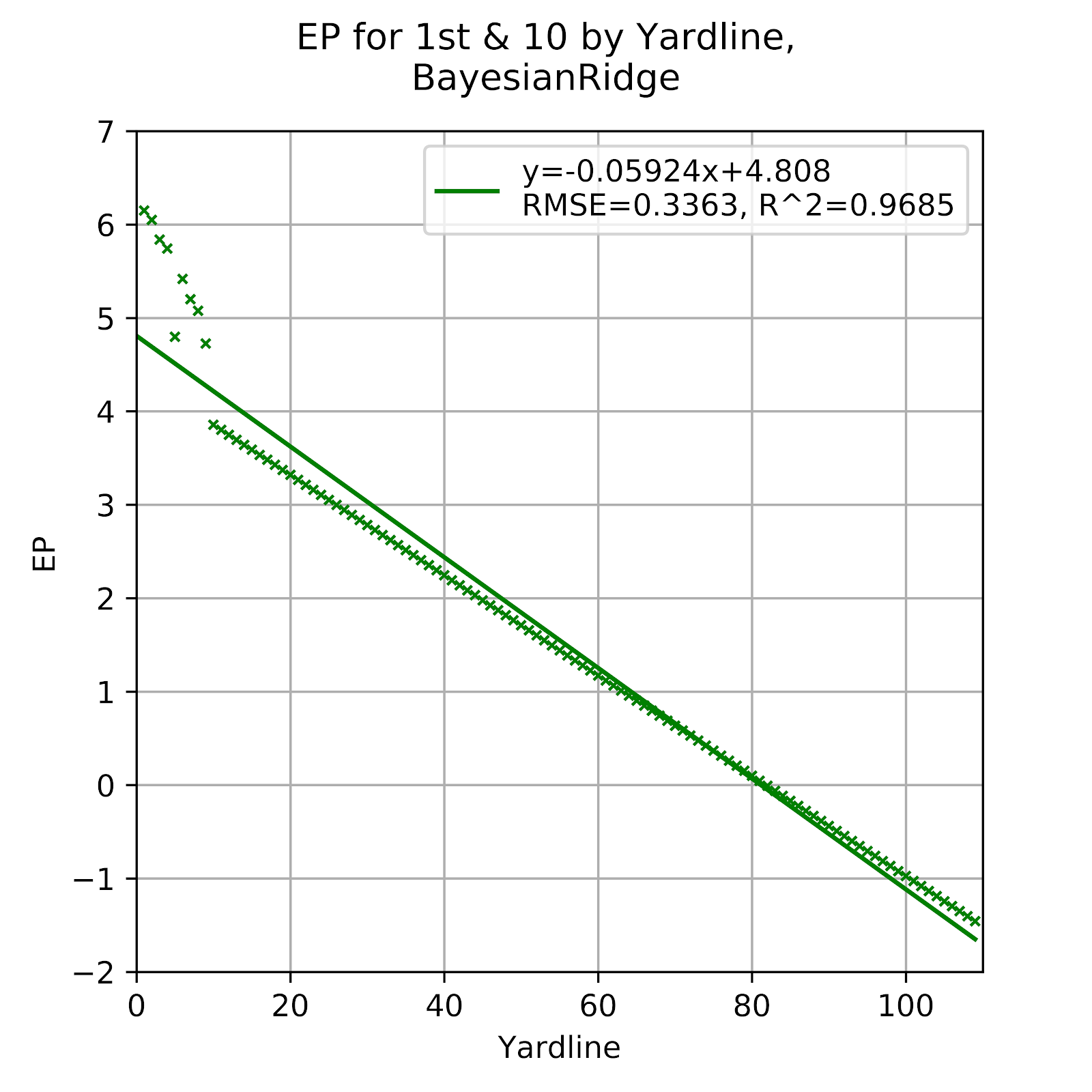
Figure 6 EP for 1st & 10 by Yardline, Bayesian Ridge
The BR data is very reasonable, especially when compared to the Ada model. It closely resembles the Elastic model, which is unsurprising as they are both related to ridge regression, the BR being a Bayesian form of ridge regression, while the Elastic model is the blending of the ridge and lasso approaches. The 1st & Goal data remains essentially a copy of the raw data, while the rest of the data is a straight line. While not the best representation of the data, it is far from the worst that has been presented in this work.
b. 2nd Down
Whereas 1st down is dominated by a surplus of data and the ease with which models can accurately approximate the raw data, 2nd down blends areas that are well-defined with areas that are poorly defined. For all the graphs below the distance to gain is limited at 25, since plays with greater distances are rare and lead to a very sparsely populated space. The models themselves include all the data, and the array of EP objects extends to the full 109 yards that is the maximum possible distance to gain, however improbable it may be. Furthermore, note that in each of the heatmaps the “impossible” combinations of distance and yardline have been omitted. These are combinations where the distance is greater than the yardline, which is truncated to & Goal, or situations where the line to gain is behind the -11, since no 1st & 10 could occur behind a team’s own -1 yard line, meaning that the line to gain cannot be behind the -11. While the models are capable of calculating EP values for such situations, they are meaningless and so have been removed.
i. Raw
Figure 7 gives the heatmap of raw EP for 2nd down. The viridis (Bob Rudis and Garnier 2018) colour scheme is perceptually continuous, meaning that the human eye perceives a given change in EP to appear as the same amount of change in colour, managed largely through the brightness of said colour. Bright yellows indicate a high EP value, while dark purples are low EP values, with the range spanning the entire possible ranger of EP values, that being the positive and negative TD values as given in Table 1.

Figure 7 EP for 2nd Down by Distance and Yardline, Raw Data
The raw data establishes what we already know - that shorter distances are better than longer distances, and that better field position is better. Note that certain extreme distance and field position combinations are left blank, meaning that there is no data, no instance of this combination occurring in the data set. The models fill in these gaps. The colouring of the data also becomes inconsistent as they are often single events, and so without the benefit of averaging multiple instances they tend to be dominated by extreme results.
ii. MLP
Given the strong prior performance of the MLP, one would expect the 2nd down data to replicate the raw data. However, unlike with the 1st down data, a greater degree of smoothing is expected from the models, especially at greater distance values where the data is more sparse. A theoretically perfect model based on an infinite quantity of data should show a smooth and continuous decline in EP with increasing distance and yardline. In Figure 8 a heatmap of the MLP 2nd down model is given.

Figure 8 EP for 2nd Down by Distance and Yardline, Multi-Layer Perceptron
Figure 8 meets expectations in its continuously decreasing EP, with the highest EP values being very near the full value of a TD, and at the opposite extreme values that we can estimate to be between 0 and -2 EP Certainly if we look along the x-axis at lower distance values, where the raw data is more certain, we get a visual sense of similarity between the MLP and raw data heatmaps.
iii. SGD
The SGD model performed poorly on 1st down in Figure 3, with prediction well below expectations, and in fact so low as to be mostly off the chart entirely.One must assume that the model sought to fit something, and that, since most of the remaining data is on 2nd down, it stands to reason that the output of 2nd down EP, seen in Figure 9, will be more representative of reality.

Figure 9 EP for 2nd Down by Distance and Yardline, Stochastic Gradient Descent
Alas, our optimism was misplaced, and the SGD model is again woefully out-of-touch with reality. The model is consistently underpredicting EP, and seems to even “bottom out” on the scale, perhaps predicting EP that are less than the negative value of a touchdown. The colour scale does not go beyond this value, so we cannot tell just from this visualization whether the value predicted is itself exactly the negative value of a TD or beyond that value, although given the degree of underprediction seen previously it seems likely that this value is exceeded. This is an impossible EP, and while it would be acceptable for a model to predict such a value occasionally, as simply the result of an extreme set of circumstances, this is certainly not something that should be seen regularly, especially on 2nd down.
Note additionally the bottom row of Figure 9 showing extremely high EP values, even increasing with increasing yardline, in total contradiction of expectations and every other model, until it shows an EP of more than 6 points at the 100 yard line, maxing out the colour scale. This bottom row is for distance 0, and while the value itself does not exist in football, the row serves as a canary for models that extrapolate poorly beyond the given data set. That we should see not only erroneous values, but also values that do not even follow the most basic of trends within the data is concerning for the model’s ability to have any predictive value. We see the same occuring at high distance values, with maxed-out values aplenty.
iv. Elastic
The Elastic model had mediocre 1st down performance in Figure 4. While not so poor as to outright dismiss the model, it raised concerns about the model’s validity in general. The model was overly smoothed and failed to show sufficient differentiation. While a certain degree of smoothing over the raw data is both expected and desirable, the model also must show differentiation, and properly handle the nonlinearities and compression effects that occur within the actual domain space of a football game. In Figure 10 we can visualize the predicted EP for 2nd down by the Elastic model.

Figure 10 EP for 2nd Down by Distance and Yardline, Stochastic Gradient Descent
Similar to the 1st down data, we see insufficient differentiation by the Elastic model in Figure 10. The lows are too high, the highs are too low. In the lower-left corner we see EP peak at about 3 EP. At the opposite end the EP values seem more in line with expectations, with EP at yardlines greater than 100 with distance 10 being about -1 or -2 EP, slightly higher but much more so than the MLP or raw graphs in Figures 7 and 8. The Elastic model is consistently over-smoothing the data to an unacceptable degree.
v. Ada
The Ada model had a 1st down graph best described as bizarre, with its stepwise jumps not seen in any other model. While this was inappropriate for a 1st down EP model, this ability to give discontinuous results can be very useful on other downs where there are significant considerations for compression effects. Figure 11 gives the visualization of the Ada model’s predictions for EP on 2nd down.
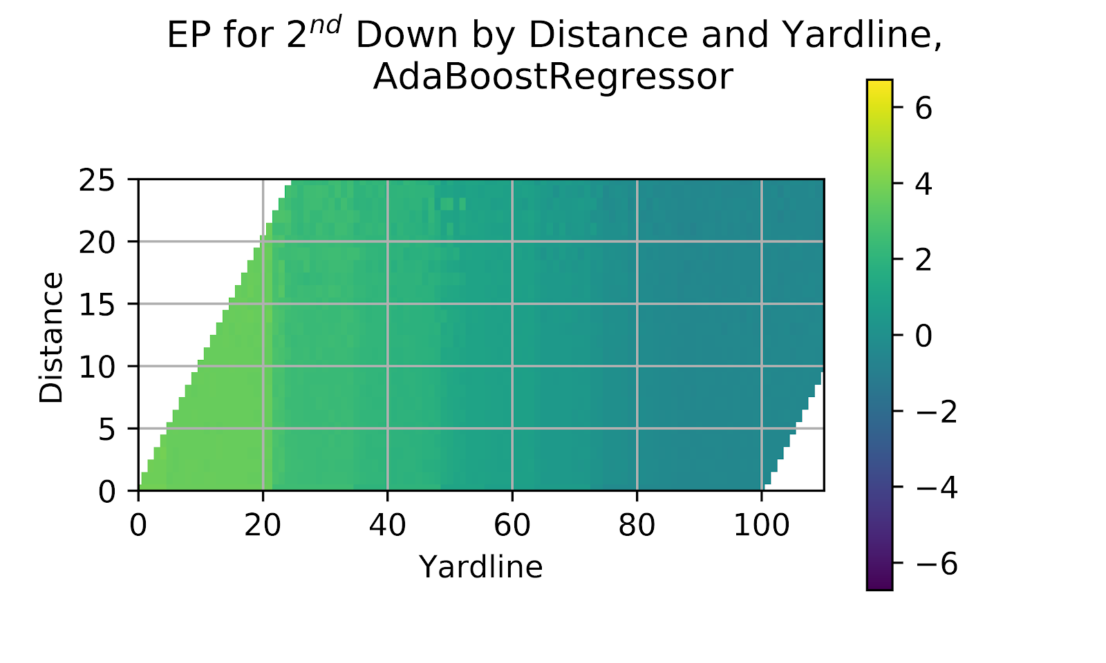
Figure 11 EP for 2nd Down by Distance and Yardline, Ada Boost
What is immediately visible at first view of Figure 11 is the distinct line at the 20 yard line. While this is generally considered to be the start of the “red zone,” it typically is not so hard a shift as that, with a sudden jump of 0.5 EP over a single yard. In the Ada model we continue to see a model to quick to make large discrete jumps. Along the y-axis we do not see any differentiation in EP with changing distance. We see another discrete jump around the 45- or 50-yard line without any specific reasoning.
vi. BR
The BR model served as a very middle-of-the-road model for 1st down, with passable if uninspiring results. The model’s preference for zeroing coefficients means that the model is likely to have an ongoing central-tendency bias. We can inspect the EP predictions of the BR model in the heatmap shown in Figure 12.

Figure 12 EP for 2nd Down by Distance and Yardline, Ada Boost
As expected, the heatmap shows a muted range of predicted EP values, and no discernible differentiation based on distance to gain. The problems for the BR model are consistent across a number of regression models - they over-regress to the mean, and fail to show adequate differentiation.
c. 3rd Down
Any analysis of 3rd down must first understand the implications of 3rd down for an offense. It is a decision point, with four options: go for it, punt, attempt a field goal, or surrender an intentional safety. Field position and distance to gain will generally obviate one or more of these options, and sometimes will only leave one viable option. The matter of optimal decision-making is an area of enormous study in American football (Yam and Lopez 2019; Romer 2006; Carter and Machol 1978) and has received some treatment in Canadian football (Clement 2018c). Each of these decisions has a range of possible outcomes of its own, and there is strong evidence that coaches are not making optimal decisions, and thus driving down the EP value of 3rd down plays, as well as those of earlier downs to a lesser extent.
i. Raw
3rd down has the sparsest dataset, as it is the most infrequent of downs - every 3rd down must have a preceding 1st and 2nd down, but a 1st or 2nd down does not imply a 3rd down, as it may well be converted. Figure 13 shows the raw EP values for 3rd down in a heatmap following the same colour scheme as for 2nd down.
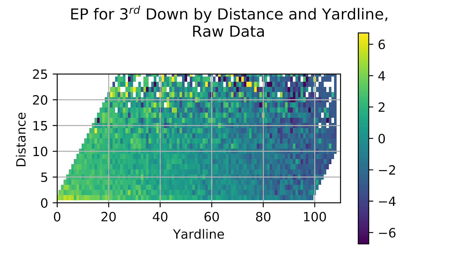
Figure 13 EP for 3rd Down by Distance and Yardline, Raw Data
As expected, EP is inversely proportional to distance as well as yardline. While exceptions abound, there is a visible trend as one moves up and to the right of the graph in Figure 13. An observation: while the sparsity of the graph increases with increasing distance, the graph has no missing points along either the left or right edge of the graph. This is the result of penalties. At the left edge we have & goal situations. The edge lies at an angle to the axes of the graph, as distance can never exceed yardline. At the right edge is where teams are backed up to the 1-yard line, and distance is limited such that the line to gain can never be behind the -11 yard line. At both ends offensive penalties can lead a team facing, say 1st & goal, to be backed up an arbitrary distance, or a team facing 1st & 10 at some arbitrary field position can be backed up to its own 1 yard line, but never further. These situations would arise relatively more frequently than adjacent points, which is why we also see a continuous colour gradient along these two edges that is not reflected in the neighbouring regions.
ii. MLP
The MLP, to date the most effective model in terms of recreating our expectations based on the raw data, seeks to continue its dominant performance through 3rd down. Figure 14 shows the heatmap of the MLP model on 3rd down.
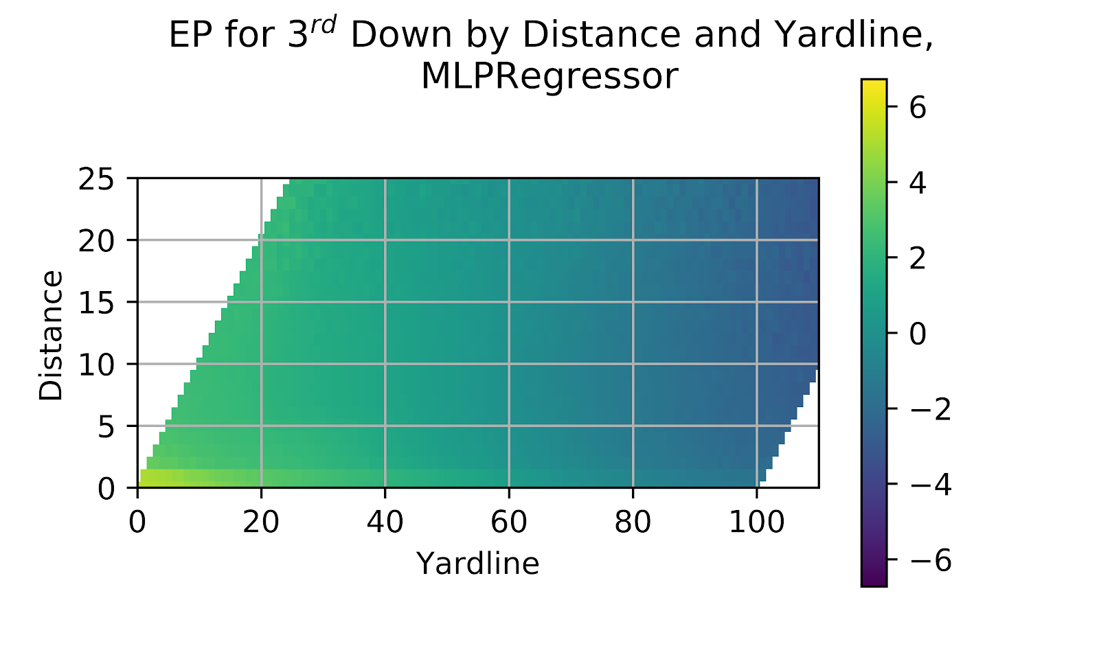
Figure 14 EP for 3rd Down by Distance and Yardline, Multi-Layer Perceptron
While the heatmap of 3rd down is similar in profile to the 2nd down heatmap in Figure 14, the EP is overall much lower. A key discontinuity occurs at 3rd & 1, where there is a sharp jump in EP over 3rd & 2. This becomes more apparent as yardline decreases. 3rd & 1 is far easier to convert than 3rd & 2- a further discussion of this is available in a prior work (Clement 2018d) - and as yardline decreases teams are increasingly willing to attempt to convert 3rd & 1, inflating EP. This effect could also be seen, albeit less clearly, in the raw data of Figure 13, where a good degree of the effect is obfuscated by noise.
iii. SGD
The SGD model performed quite poorly on 1st and 2nd down, where it gave erroneous values and utterly failed to predict out-of-sample values. In Figure 15 we see the model’s performance on 3rd down.
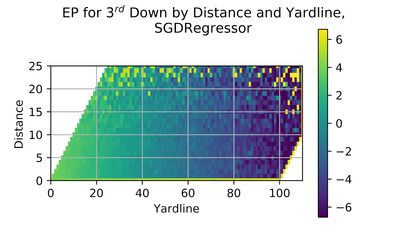
Figure 15 EP for 3rd Down by Distance and Yardline, Stochastic Gradient Descent
The SGD model fails to show any improvement on its prior performance when looking at the 3rd down heatmap in Figure 15. Out-of-sample prediction is, politely, out to lunch, as is the entire set of EP predictions. The SGD model is clearly not fit for use as an EP model, and further examination of its correlation graphs will not be worthwhile to assess its predictive ability, but rather to test the utility of correlation graphs themselves, whether a poor model can have counterbalancing errors leading to a good calibration.
iv. Elastic
The Elastic model had previously found itself failing to differentiate EP by distance to gain in Figure 10 for its 2nd down results. The results for 3rd down are given in Figure 16, where the model again fails to distinguish by distance. The Elastic model shows that while it is a popular choice for other regression types, it is a poor choice for modelling EP.
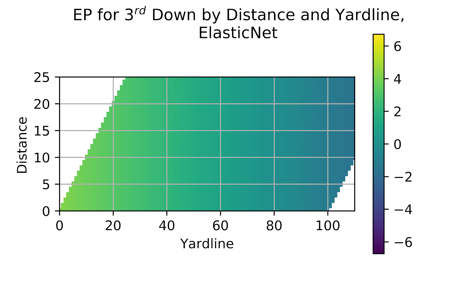
Figure 16 EP for 3rd Down by Distance and Yardline, ElasticNet
v. Ada
The Ada model, like the Elastic model before it, struggled to differentiate in 2nd down based on distance. In general the model groups together too many disparate situations with unusual discontinuities. The results for the Ada model in Figure 17 are no different. The data makes several discrete jumps, and there is no distinction between distances to gain within the most common area of the graph.
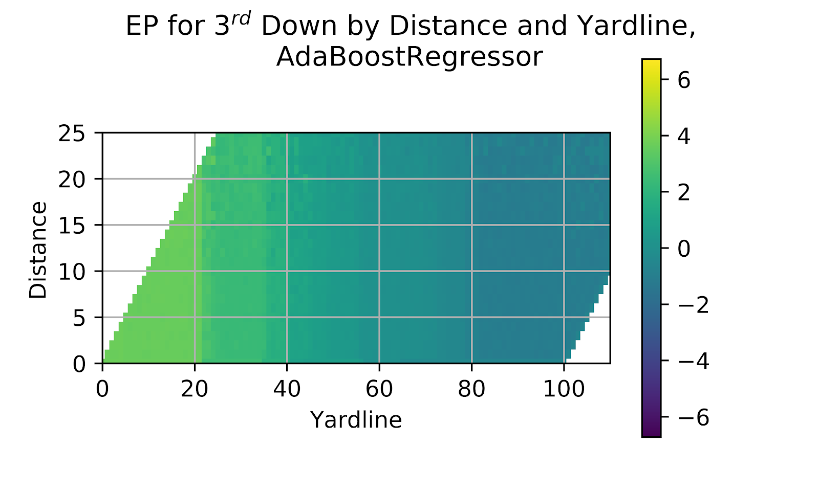
Figure 17 EP for 3rd Down by Distance and Yardline, Ada
vi. BR
The final model under consideration is the BR model, which, like the two preceding models, failed to show a difference in EP for different distances to gain in Figure 12 for 2nd down. Figure 18 gives the results for 3rd down, which show the same recurrent issue. The models are oversmoothed and are not adequately considering the impact of distance.
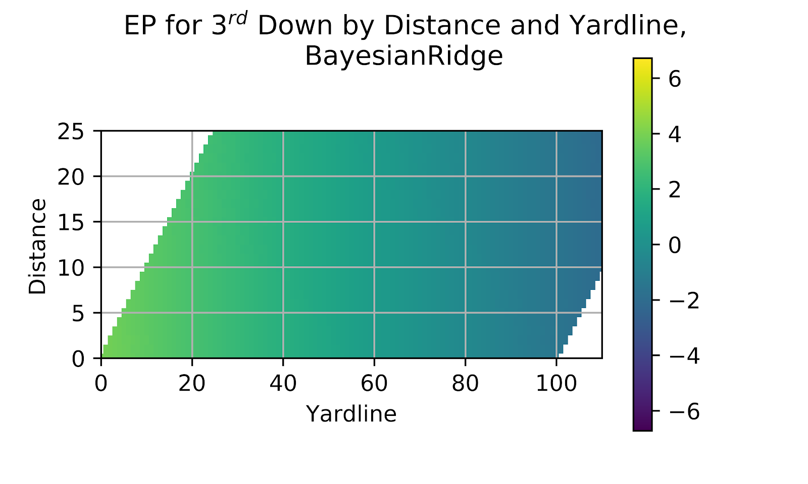
Figure 18 EP for 3rd Down by Distance and Yardline, Gradient Boosting
5. Model Correlation
While the above figures allow us to get a visual sense of both the predicted EP values as well as an approximation of the closeness between the predicted and raw values, the standard approach for determining the efficacy of a model in predicting actual values is the correlation graph. While other methods exist, the correlation graph offers certain specific advantages: the correlation graph is easily understood - the more closely a line resembles y=x the better the model predicts future outcomes; the graph is easily interpreted - we can see the stronger and weaker areas of the model; the graph can show uncertainty - it is relatively trivial to show some measure of uncertainty in the measurements and; the graph can be split in many different ways in order to show any systemic bias. The correlation graphs below run from the negative value of a touchdown to the positive value of a touchdown. Since true EP cannot go outside this domain and predictions outside of it are necessarily erroneous. While it may still be acceptable for a model to exceed these limits in some extreme cases it is not something we hope to see commonly. As with previous works, there is a minimum value of N=100 to show a point on the graph, in order to avoid filling the graph with rare values with very large uncertainty. Each point is binned to the nearest 1/10 of a point of predicted EP, and the actual value is the average of the true outcomes, with the error bars being the 95% confidence interval based on 1000 bootstrap iterations.
Frankly, the domain of the graph could be reduced from the negative value of a touchdown to the negative value of a safety, but some poorer-performing models might have a number of points lying outside the graph.
a. General Correlation
Table 3 shows the R2 and RMSE of the data against y=x. While these are not perfect measures, they do a good job of giving an apples-to-apples measure. With a quick glance at the table we see mostly similar values, except for the SGD model, whose R2 value is incomprehensible. What this looks like will be seen in the upcoming section.
Table 3 Correlation Coefficients for EP Regression Models
Looking at Table 3 we see the best relationships for the MLP model, with far better results than any other model. The Elastic, Ada, and BR models follow, all with passable-seeming metrics, while the SGD is so far off as to engender curiosity.
i. MLP
The MLP model was one of the top three classification model in the prior work (Clement 2019), and the graph in Figure 19 supports this notion. We see a model that tightly hews to the ideal line, with the R2 and RMSE to match.
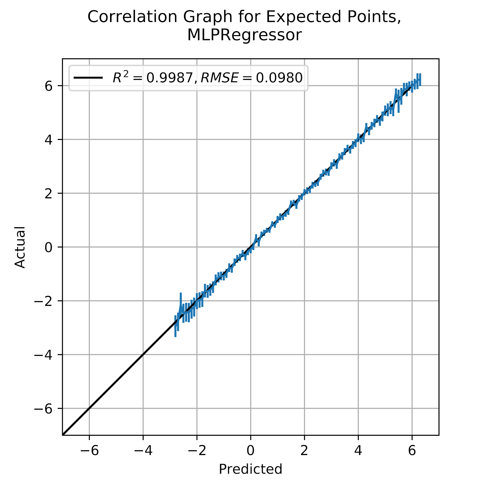
Figure 19 Correlation Graph for Multi-Layer Perceptron EP Regression Model
ii. SGD
The much-anticipated correlation graph for the much-maligned SGD model is available in Figure 20 below. With such extreme values of R2 and RMSE nothing short of a totally absurd graph can be expected.

Figure 20 Correlation Graph for Stochastic Gradient Descent EP Regression Model
Figure 20 does not disappoint. Predicted EP shows no correlation to reality, and appears to extend well beyond the left edge of the graph. The SGD model seems to be worse than useless, and any further discussion will only serve to satisfy the morbid curiosity to see how bad it can get.
iii. Elastic
The Elastic model was criticized above for having too little range in its prediction domain, and for neglecting the importance of distance to gain. In Figure 21 we see the correlation graph for the model.

Figure 21 Correlation Graph for ElasticNet EP Regression Model
While the correlation is quite good, with a slight overprediction at the low end and underprediction at the high end, what we do see is a very diminished doman. The EP predictions do not go low enough, stopping around -1.75, while on the other hand they stop at +4. Since 1st & 1 at the 1 yard line is about 6.2 raw EP, and anything within the 20-yard line is above 4 EP, we can see why there is an area of underprediction. This is too far from the raw data, and in an area where we have excellent confidence, to dismiss, and it is ultimately disqualifying for the Elastic model.
iv. Ada
The Ada model has returned some of the most bizarre results so far, with its staccato interpretation of 1st down and its discrete jumps at arbitrary points of field position. Ada’s correlation graph is below in Figure 22, where we can hope to see how the model works as a predictor, at least on a large scale.
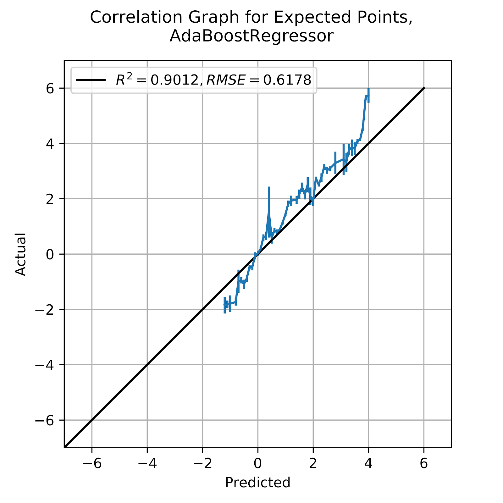
Figure 22 Correlation Graph for Ada Boost EP Regression Model
From Figure 22, we see that Ada appears to find a way to be right in the aggregate despite being constantly wrong in the specifics. Not the large jumps between points on the graph, where the model skips over values without any obvious reason. While a perfect model would still technically be bound to the discrete nature of the domain of the features, the overall result would still tend to appear relatively continuous. Even just first down steps incrementally at arbitrary points.
v. BR
The primary criticism of the BR model was its central tendency bias, something that is common to a number of different models both in this work. The model lacked sufficient differentiation compared to its more popular competitors and to the raw data. The graph shown in Figure 23 gives the correlation between predicted and actual EP for the BR model.
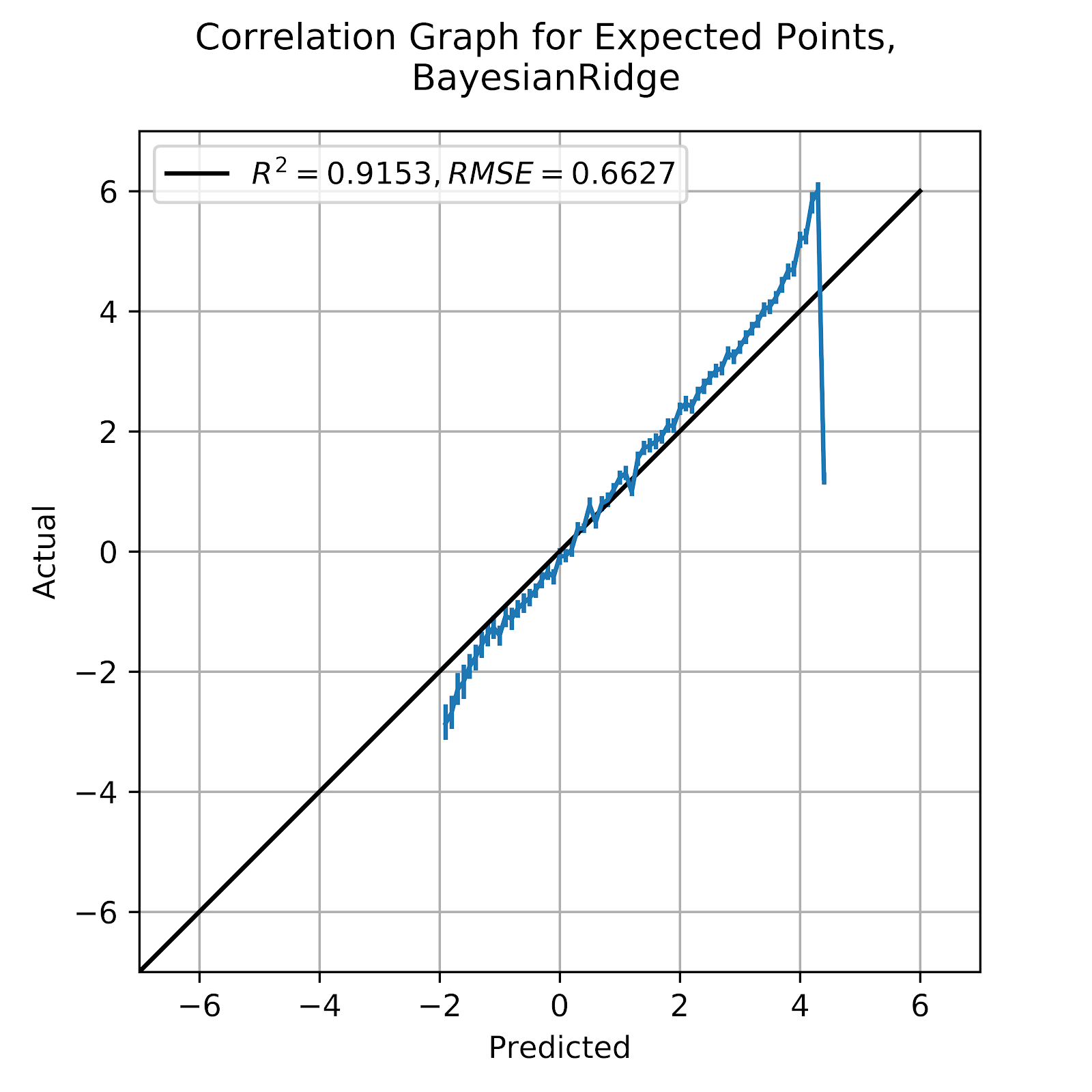
Figure 23 Correlation Graph for Bayesian Ridge EP Regression Model
While the results of the BR model in Figure 23 are not terrible, we do see at the two extremes that the results break away from the ideal line, overpredicting low EP and underpredicting high EP, fitting with the central tendency bias that was seen in Figures 6, 12, and 18. Based on the evidence so far, the BR model is not irredeemably bad, but it is an inadequate model compared to some of the better approaches that we have, both classification and regression models.
b. By Quarter
While a general correlation graph, such as those above, are useful for determining at a glance if a model is well-calibrated, they do not always allow us to see if a model is showing bias along one of its inputs, or along a different feature that was not included in the model. A common criticism of EP models is their failure to consider time remaining in the game or half. Although some current models do incorporate time remaining (Horowitz, Yurko, and Ventura 2017), this model does not do so, in an attempt to provide proof-of-concept models. So while models may be generally well-calibrated we do expect to see some biases in EP across quarters, especially as the game continues and Win Probability (WP) concerns begin to outweigh EP concerns. In Table 4 there is a summary of the correlation coefficients for each of the models by quarter. Note that overtime has been omitted from these because of the comparatively small number of plays and the generally artificial nature of gameplay, where WP and game theory concerns necessarily outweigh any thoughts of EP.Table 4 Correlation Coefficients for EP Regression Models, by Quarter
i. MLP
The MLP model has been consistent as the most well-calibrated regression model, and so it is serendipitous that it should be listed first here. This was not by design, but the MLP model was simply the only holdover model from the classification model list, and other models were then appended. Figure 24 gives the four calibration graphs by quarter for the MLP model.

Figure 24 Correlation Graph for Multi-Layer Perceptron EP Regression Model, by Quarter
We should expect Figure 24 to be somewhat noisier than the calibration graph for the entire model, simply due to smaller sample sizes. What we should be looking for are signs of bias in the data by quarter. We see very little in this Figure, except perhaps at the high-EP end of the 4th quarter, where there appears to be a certain degree of underprediction, with the opposite, albeit even more subtly, in the 1st and 3rd quarters. This distinction is small enough that it may be the product of randomness, but it may relate to late-game effects in the 4th quarter where a leading team may simply choose to sit on a lead and run out the clock where they could otherwise score, or a trailing team making sub-optimal EP decisions out of necessity. It should be noted that any discussion of optimal decision-making is fraught with issues of its own, and goes beyond the scope of this work. Certainly a team kneeling out the game will drive down EP, something that happens most often in the 4th quarter. This would cause the resultant underprediction in the 1st and 3rd quarters as the model attempts to balance between the two, itself unaware of the quarter. The 2nd quarter then seems to be at a balance point between the two. We do see teams occasionally kneel out, but not as much as in the 4th quarter, and so it finds the sweet spot of the model. This is the sort of bias we would expect to see from a first-order model that does not consider the broader game situation, and one that can be rectified in future iterations once we have identified the best choice of models.
ii. SGD
The overall calibration graph for the SGD was horrendous, and but for the whims of thoroughness, discussion of it would cease there. We look at Figure 25 to see the SGD model broken down by quarter to see if any further issues. Unfortunately, the model is so miscalibrated that it is difficult to identify anything else beyond the mess of noise.
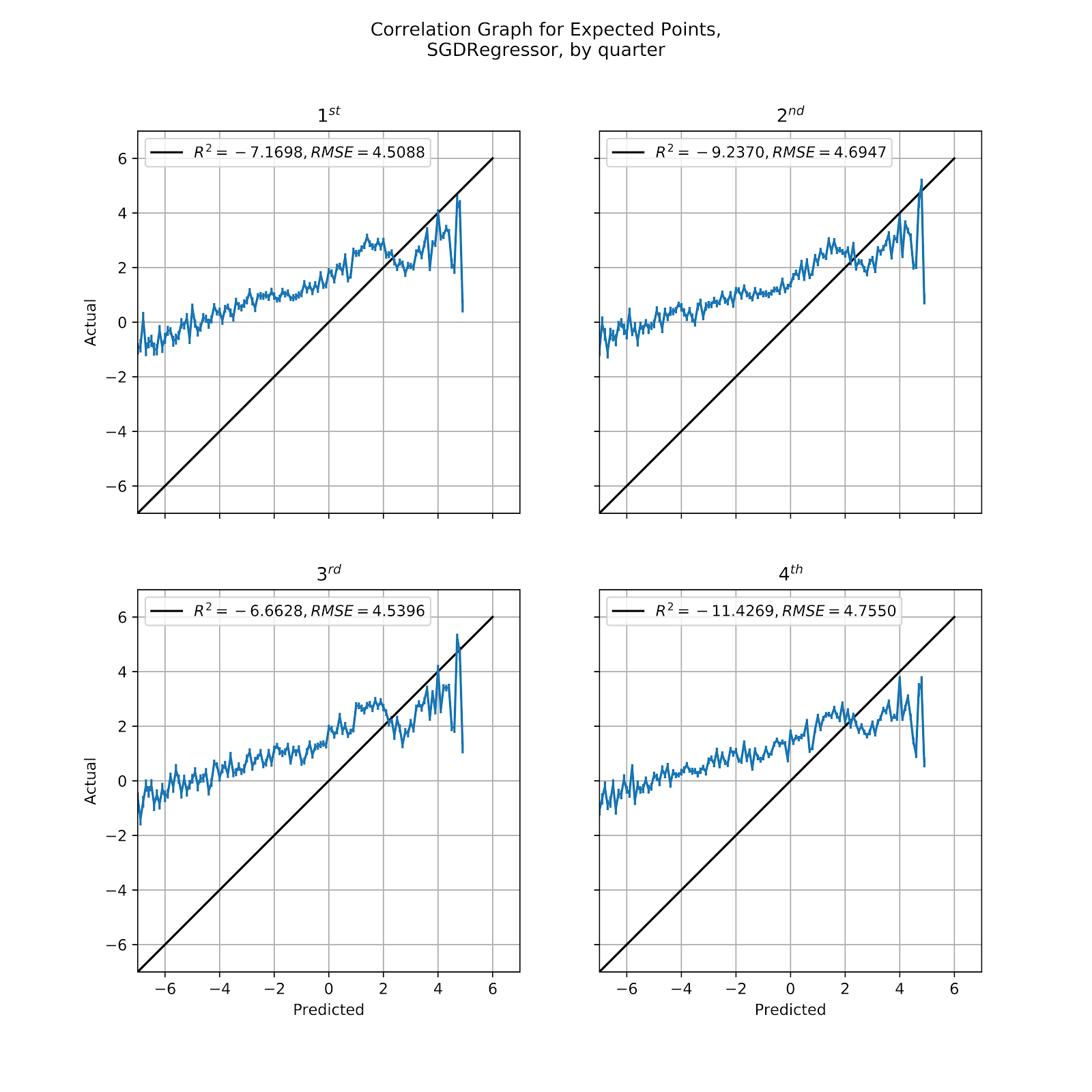
Figure 25 Correlation Graph for SGD EP Regression Model, by Quarter
iii. Elastic
The Elastic model was the first in a trio of models of mediocre performance, generally well-calibrated but failing to make effective distinctions between different values of EP, especially when looking at distance to gain, rather overvaluing yardline as a predictor. In Figure 26 we see the correlation graph by quarter of the Elastic model. It shows an overprediction in the high-EP ranges across the first three quarters, and reverts to being well-calibrated in the 4th quarter. If we compare these relatively we see the same pattern as we saw in the MLP model, where the 4th quarter comes in lower than the other quarters, especially the 1st and 3rd, because of teams running out the clock. We also see that the model is consistent in its lack of valid range compared to the raw data and MLP models. However, one should consider the unusual nature of the lower-bound of EP value. In principle, a team can choose to surrender a safety at any time that they have the ball. Ergo, the value of a safety, -2.9936 points, should be the lower bound of EP, since any time that EP would be below that value the offense could simply surrender an intentional safety. This is an interesting area of future research, likely tied to optimizing 3rd down decision-making. Within the range of predicted values the Elastic model does appear to be well-calibrated, with a single notable exception at +4 EP, but given the isolated nature of this erroneous point it appears to be the product of some kind of edge case. The large underprediction in the last two points of each model is the residual of the model simply not encompassing the entire range of possible EP values, agglomerating everything above +4 EP into the +4.1 EP bin.
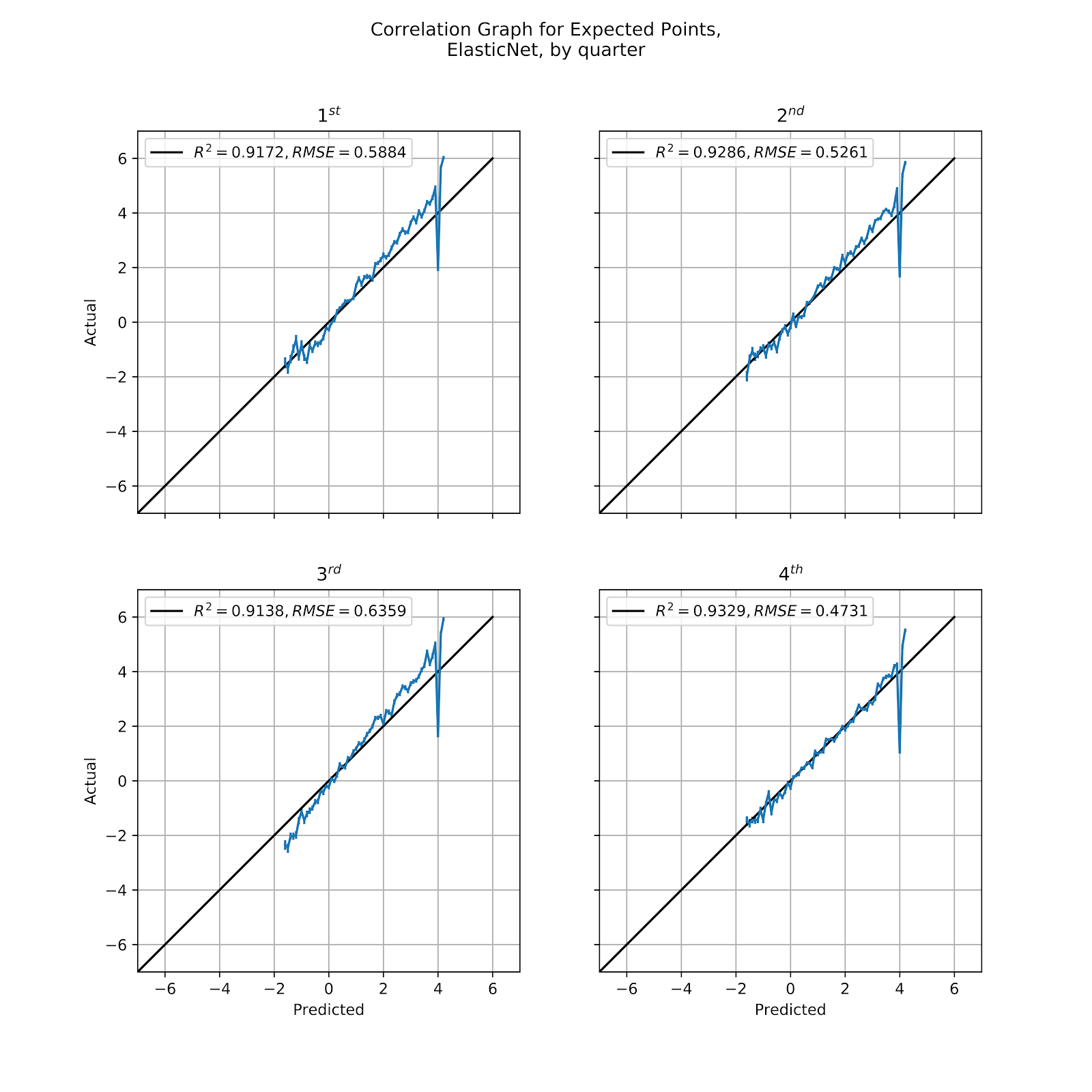
Figure 26 Correlation Graph for Elastic EP Regression Model, by Quarter
iv. Ada
The Ada model gave similar results to the Elastic model for its calibration curve in Figure 22, but its value graphs in Figures 3, 9, 15 stood out for their stepwise nature. In Figure 27 we look at the calibration graph for the Ada model by quarter, where we see that, while it does follow the general shape of the ideal trendline, it is not an especially good fit, faring worse than either the MLP or Elastic models. Because the model does not encompass the entire range of values, much like the Elastic model, we still see the underprediction at the +4 EP point. Because this model is also limited at the lower end of the domain it also creates an area of overprediction.
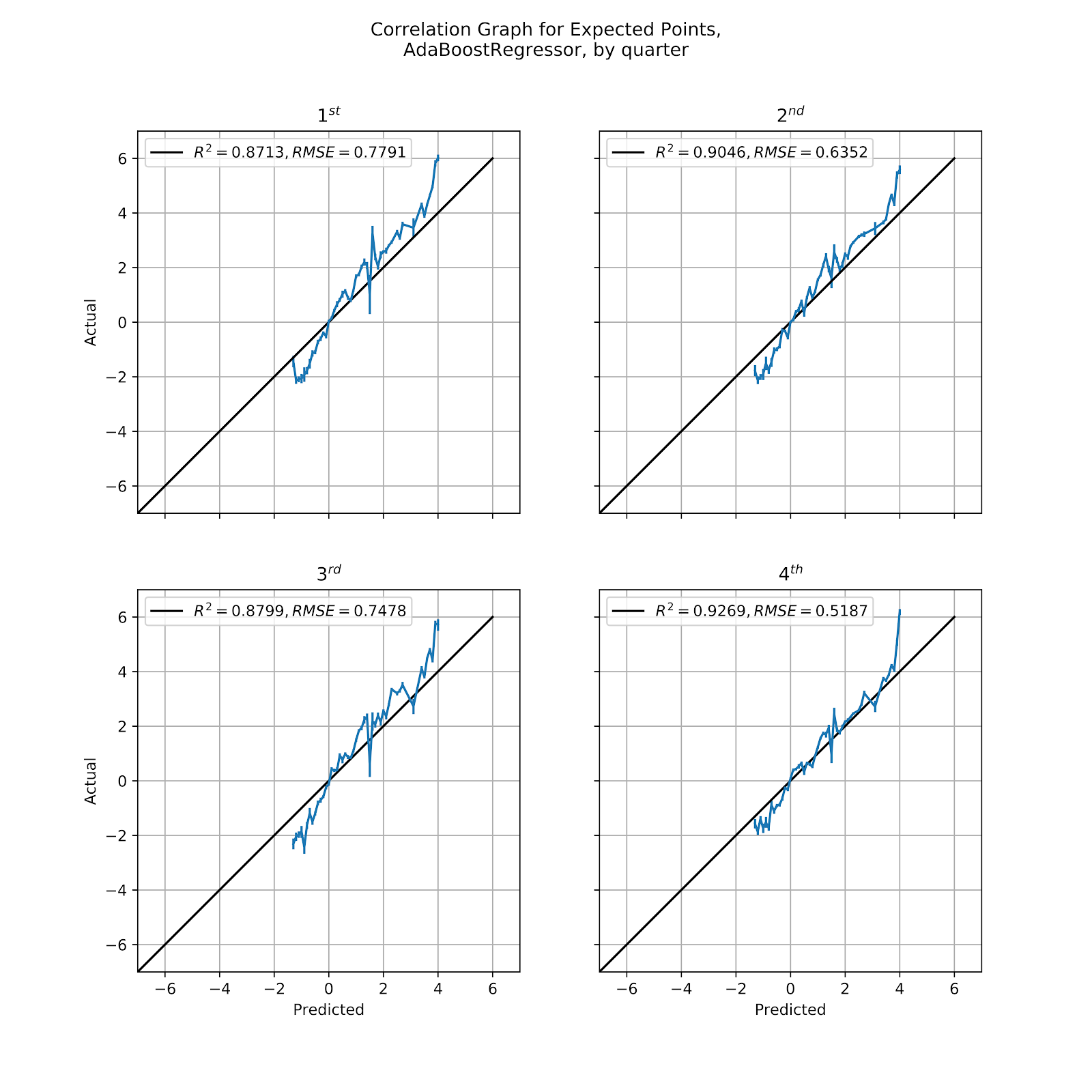
Figure 27 Correlation Graph for Ada EP Regression Model, by Quarter
Attempting to read between the lines of these is tricky, though the 4th quarter seems best-calibrated, implying poorer calibrations in the other three quarters. With that, comes the most extreme case of underprediction, where the other quarters seems to underpredict over a broader range. Overall the calibration graphs are extremely noisy, indicative of the erratic predictions seen from the Ada model.
v. BR
The results for the BR model were similar to those for the Elastic model, and so we expect similar calibration graphs in Figure 28. As with other models we see generalized underprediction in the first three quarters and then the 4th quarter is more closely aligned along the majority of its domain, only underprecting as we reach the higher EP values. The final data point in each graph then turns sharply downward to become a large overprediction. Understanding the reason behind this would require a deeper dive into the data and isolating what features are causing this extreme swing.

Figure 28 Correlation Graph for Bayesian Ridge EP Regression Model, by Quarter
c. By Down
Splitting the correlation graphs by down gives us a different way of looking at our model. Down is a feature in the model, and the only feature with a sufficiently limited domain that we can look at all possible values at once. While we expected to see certain systemic biases in the correlation graphs for quarter, we should not see such issues with down, since this is one of the inputs of the model. We do expect to see 3rd down with perhaps a weaker correlation, given that this is a decision point, and because the overall sample size is smaller. Sub-optimal decision-making on 3rd down may also cause unusual correlations. In Table 4 We have the correlation coefficients for each of the models and each down.
Table 4 Correlation Coefficients for EP Regression Models, by Quarter, by Down
i. MLP
The MLP model has been the standard for all models in this work thus far, and in Figure 29 we see the calibration graphs split out by down. The correlation coefficients across all three are excellent, and we do see the increased noise on 3rd down that had been predicted. This is especially prevalent at higher EP values, in the areas where teams are faced with the decision to kick a field goal or go for the conversion attempt. These are likely & Goal situations, and so these lead to touchdowns if successfully converted. 1st and 2nd down have R2 values of over 0.99 and corresponding RMSE values, so their calibration here is not in doubt.
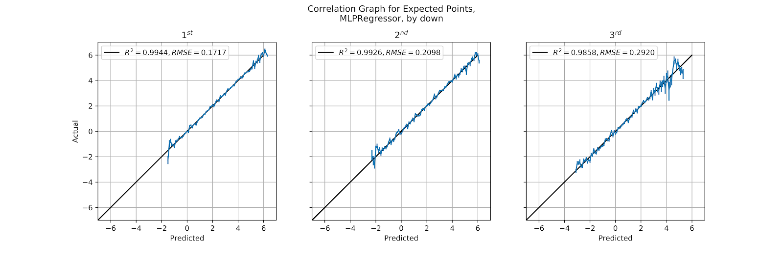
Figure 29 Correlation Graph for Multi-Layer Perceptron EP Regression Model, by Down
ii. SGD
The SGD model’s calibration values have not been any better than the straight results, which is to say that they are atrocious. Figure 30 shows that SGD is awful independent of the down. There may be some use for this model in football analytics, but it is not as a model of EP. A more masochistic researcher may find some degree of pleasure in noting that even though the model produces results that are irrelevant to any practical application, the shape of the curve is always generally consistent, both by down and by quarter. Here we have a noisy linear section, which dips, spikes up, and then drops off. Why this happens is both beyond the scope of this work and beyond the interest of the author.
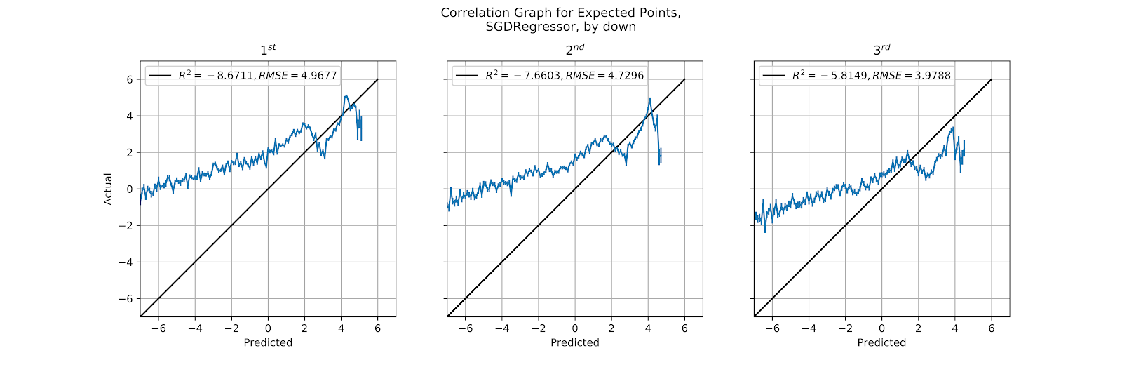
Figure 30 Correlation Graph for SGD EP Regression Model, by Down
iii. Elastic
In the first part of this work the Elastic model was criticized for not sufficiently weighting distance to gain, and later was criticized for its lack of range in EP values. Here in Figure 31 we see again that the model lacks sufficient range, with no predictions above +4 EP, and we add a new complaint, that it doesn’t sufficiently discriminate based on down. 1st down, ceteris paribus, should have higher EP than the other downs, and 3rd down the lowest. Thereafter the downs should be well-calibrated. In Figure 31 we see that 1st down is underpredicted, 2nd down is about right, and 3rd down is greatly overpredicted. The consistency with which this happens implies that all the EP values are being pushed toward the middle, that 1st down values are all too low, and 3rd down values are all too high. The central tendency bias applies not just to distance to gain but also to down, the model is overfitting based on field position to the detriment of the other features.
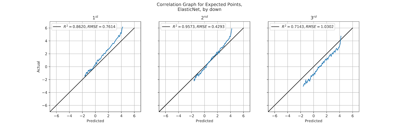
Figure 31 Correlation Graph for Elastic EP Regression Model, by Down
iv. Ada
The Ada model has been a poor-performing model, and in Figure 32 it does little to allay those concerns. The model is noisy, poorly calibrated, and has a compressed range. Just as Figure 5 showed that on 1st down the model jumps between discrete EP values we see the same here in the calibration graph, where there are long spans between points in the plot. While the graph certainly is not obligated to be purely continuous, There are far too few possible outputs of the model to make sense given the range of possible inputs.
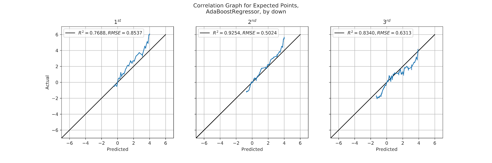
Figure 32 Correlation Graph for Ada EP Regression Model, by Down
v. BR
While the BR model has so far been better than either the SGD or the Ada model, and about equal to the Elastic model, the complaints about the BR model have been consistent. As visible in Figure 33 below, we see the same issue plagues the BR model as the Elastic model; the down feature is undervalued, leading to 1st down being underpredicted and 3rd down being overpredicted. The different linear models are reducing the features to the detriment of the model’s results.
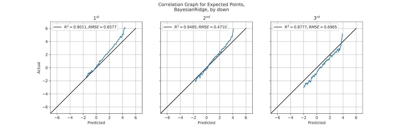
Figure 33 Correlation Graph for BR EP Regression Model, by Down
d. By Home/Away
The final dimension along which to split our data to test our calibrations is whether the offensive team is home or away. This is stored as a play-level attribute offense_is_home as a boolean, False if the offense is the away team, and True if they are the home team. We expect a significant across-the-board bias in our model here because of the home-field advantage in football (Vergin and Sosik 1999; Jamieson 2010). EP for the away team should be overpredicted, while EP for the home team should be underpredicted. In addition to ordinary home-field advantage, the presence of playoff games in the dataset where the home team is the higher-seeded team, and so is inherently more likely to score. In Table 5 we have the correlation coefficients of our different calibration graphs, where we see the same patterns as before, with MLP as the best model, SGD the worst, and the other three grouped in the middle.
Table 5 Correlation Coefficients for EP Regression Models, by Home/Away
i. MLP
The MLP model has been consistently well-calibrated, and in Figure 34 we see it broken out by home and away. We see, as expected, a well-calibrated model that overpredicts for the away team and underpredicts for the home team. What is interesting is that the degree of this bias is inversely proportional to the predicted EP, though some of this would be due to compression effects since actual EP cannot exceed the value of a touchdown (6.7257 points).

Figure 34 Correlation graph for MLP EP Regression Model, by Home/Away
ii. SGD
The SGD model, which has been thoroughly derided here, continues to give nonsensical results, as seen in Figure 35, which are too erroneous to be worth any discussion.
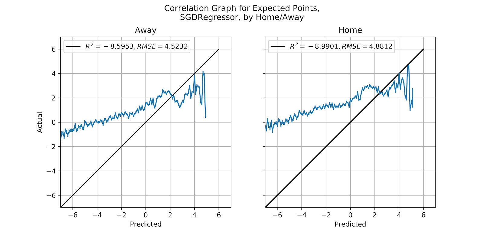
Figure 35 Correlation graph for SGD EP Regression Model, by Home/Away
iii. Elastic
The Elastic model has been well-calibrated within its valid range, if we neglect the issues at the extremes of the graph. In Figure 36 the home graph is properly underpredicted, but the away graph is not symmetrical in its overprediction, something we might attribute the the data being compressed at +4 EP disrupting the proper shape of the data.
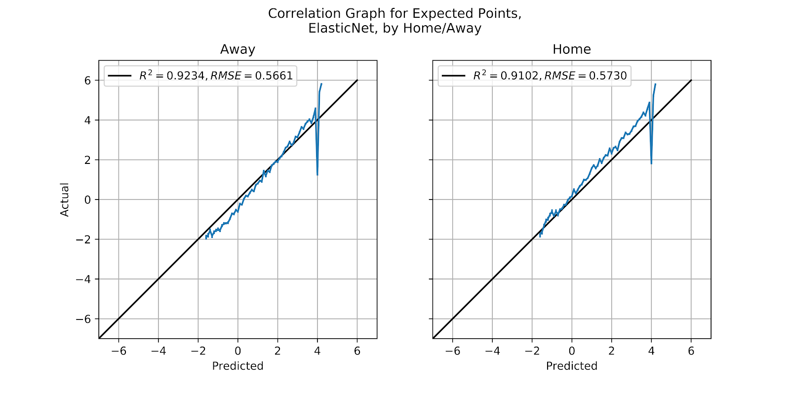
Figure 36 Correlation graph for Elastic EP Regression Model, by Home/Away
iv. Ada
While the Ada model has been better than the SGD, it still has not inspired sufficient confidence in its results to merit any future work. When looking at Figure 37 to see the data split by home and away we do see the impact of home field advantage but it is just the translation of a very ill-fitted model, and so its predictive value, while perhaps mediocre in the aggregate, is generally useless in specific instances.
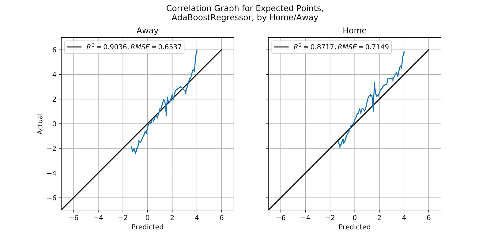
Figure 37 Correlation graph for Ada EP Regression Model, by Home/Away
v. BR
The BR model’s results have so often mirrored those of the Elastic model, and here we find no exception. In Figure 38 the home graph is well-calibrated with the expected amount of underprediction, while the away graph is overpredicted, but only in the high-EP range, possibly a result of the range of values not properly extending to 6.7257, the value of a touchdown. This is very similar to the results for the Elastic model seen in Figure 36, and while these are the two best models aside from the MLP, they are still poor models overall.

Figure 38 Correlation graph for BR EP Regression Model, by Home/Away
6. Conclusion
Having looked at five different EP regression models, only the MLP model truly stands out as a useful model. It is well-calibrated, and shows the biases we expect it to have based on the features given, and no more. The other four models range from poor - the Elastic and BR models - to bizarre - the Ada model - to outright absurd - the SGD model. Unlike the classification models (Clement 2019) where every model was at least functional, four of the models proved unusable. While some of the models’ performances could have been improved by tweaking parameters or by normalizing data, this was beyond the scope of the work, and opens the question of overfitting, and would simply be unlikely to provide better results than the MLP model.
To review the performance of each of the other four models in some greater detail, the SGD model never provided coherent results. Neither qualitatively, when the 1st down results in Figure 3 had no relationship to reality, nor quantitatively, when the calibration graphs were literally off the charts in Figures 20, 25, 30, and 35.
The Ada model gave strange results starting in Figure 5. While the aggregate results of the model were passable in every case, at least according to the correlation coefficients, the R2 and RMSE values, even a cursory visual inspection of the results shows the absurdity of the results. This itself may prove to be a note of caution to all researchers to plot their data and actually look at their results. The Ada model proved totally unusable for this reason, as well as its inability to predict any EP values greater than +4 EP.
The Elastic and BR models were very similar. Both gave decent results, but, like the Ada model, declined to predict any EP values greater than +4 EP. They also greatly undervalued down and distance to gain as predictive features, leading to undesired biases in Figures 31 and 33, and visible issues in the heatmaps in Figures 4, 6, 10, and 12.
A thorough comparison of the classification and regression models in a head to head manner is the stuff of another article entirely, but we might note that classification models overall gave better results than regression models, but that they are very slow to fit, whereas the regression models were all much faster to fit. As long as the models do not need to be repeatedly refitted in real time this should not be an issue, and in short order the continuing growth of consumer computing power will render this issue largely irrelevant. Regression models for EP do not appear to be a superior option compared to classification, which appear to offer better predictive ability, as well as the ability to predict on a more granular level what type of scoring play is most likely to occur next. Whether the probability predictions at the class level are accurate is also the subject of further study.
7. References
Bob Rudis, Noam Ross, and Simon Garnier. 2018. “The Viridis Color Palettes.” March 29, 2018. https://cran.r-project.org/web/packages/viridis/vignettes/intro-to-viridis.html.
Clement, Christopher M. 2018a. “Score, Score, Score Some More: Expected Points in American Football.” Passes & Patterns. June 5, 2018. http://passesandpatterns.blogspot.com/2018/06/score-score-score-some-more-expected.html.
———. 2018b. “It’s the Data, Stupid: Development of a U Sports Football Database.” Passes and Patterns. June 30, 2018. http://passesandpatterns.blogspot.com/2018/06/its-data-stupid-development-of-u-sports.html.
———. 2018c. “Due North: Analytics Research in Canadian Football.” Passes & Patterns. August 23, 2018. https://passesandpatterns.blogspot.com/2018/08/due-north-analytics-research-in.html.
———. 2018d. “Three Downs Away: P(1D) In U Sports Football.” Passes & Patterns. August 23, 2018. http://passesandpatterns.blogspot.com/2018/08/three-downs-away-p1d-in-u-sports.html.
———. 2018e. “The Roman Numerals of Computing: An Object-Oriented Database of U Sports Football.” Passes & Patterns. October 13, 2018. https://passesandpatterns.blogspot.com/2018/10/the-roman-numerals-of-computing-object.html.
———. 2019. “It’s Spelt ‘Rouge:’ Expected Points in U Sports.” Passes & Patterns. February 21, 2019. https://passesandpatterns.blogspot.com/2019/02/its-spelt-rouge-expected-points-in-u_21.html.


No comments:
Post a Comment