1. Abstract
Using the three highest-performing models from the previous examination of EP classification models (Clement 2019a), this work looks at how well these models are able to predict the individual classes of future scoring. The k-Nearest Neighbours (kNN) model performs adequately, but not as well as the Multi-Layer Perceptron (MLP) and Gradient Boosting Classifier (GBC), which performed very well, the GBC slightly better than the MLP. The models all show bias by quarter, demonstrating the need to include game time as a factor, and home-field advantage. Future work will involve feature selection and fine-tuning of the MLP and GBC models.
2. Introduction
Previous work on EP models has looked at the output of the model as an EP value. With regression models (Clement 2020a) this is obvious, as the output of the model is an EP value. When using a classification model the output is a set of probabilities for each possible outcome class. These can be mapped to the point values of each score, adjusted for the knock-on effects of the ensuing kickoff or change of possession. In evaluating the performance of the model it can be done at two levels” One can look at whether or not the final EP values match with reality, or one can compare the predicted probabilities of the individual classes against their actual outcomes. Here we are looking to do the latter, having already accomplished the former in a prior work, which served to make a` first pass to identify models that offered the possibility of utility.
3. Models
In this work we are looking at models from the prior work on classification models (Clement 2019a). While that work examined five different classification models, here we will only be focusing on three of those models, and have eliminated the logistic regression and random forest models. This was done in the interest of brevity and focus, as those were the two-worst-performing models. The three remaining models are k-Nearest Neighbours (kNN), Multi-Layer Perceptron (MLP) and Gradient Boosting Classifier (GBC). These three models all performed well in predicting the EP values, and the goal of this work is to evaluate their performance at predicting the individual probabilities that feed into those values.
We are retaining the same features as before - down, distance, and field position - as the core features behind any EP model. There are other features of value, such as time and home field advantage, that have shown themselves quite useful (Horowitz, Yurko, and Ventura 2017), in order to reduce the dimensionality of the models and make preliminary determinations about the efficacy of various models. Data from the 2019 season has been added to the database (Clement 2020b), and will be included in this evaluation. The addition of the data did not noticeably change the performance of any of the models.
The models are each described in brief below; a more thorough examination of these models can be found in the previous work or in the sklearn documentation (Pedregosa et al. 2011).
a. kNN
The k-Nearest Neighbours sklearn.neighbors.kNeighborsClassifier model was the worst-performing of the three models, but still had excellent performance and gave comparable performance to the other two models while requiring a fraction of the training time. It also provides a benchmark for the more complex models. kNN can perform well in data-rich areas because there is enough information to be able to take a simple mean, and even in data-sparse environments it can give passable results, but it struggles near the boundaries of the domain of the input data, because it has to draw from outside its own point, but it cannot draw symmetrically, so it ends up drawing additional data in only one direction, towards the centre of the data, since no data exists in the other direction. This is especially visible at the corners of the dataset.
b. MLP
The Multi-Layer Perceptron sklearn.neural_network.MLPClassifier was one of the two top-performing models based on their EP values (Clement 2019a). Unfortunately both of the top performers had very slow fit times, raising questions about scalability of the models. While standardizing the inputs is recommended for the MLP (Pedregosa et al. 2011), the model has proven very effective with no preprocessing of the data. The strength of a neural network is in finding the interactions between features, which is especially important in areas such as the red zone, where the assumption of linearity breaks down and where the kNN model is weakest.
c. GBC
Gradient Boosting Classifiers are an ensemble method that comes from sklearn.ensemble.GradientBoostingClassifier and are a form of tree model where each tree builds on its predecessor. The GBC performed comparably to the MLP model, but with even slower fit times. GBC handles categorical data as well as continuous, and even though sklearn itself does not support categorical features, the ordinal nature of downs allows GBC to treat them categorically. This will also prove useful for the addition of further features to the model.
4. Probability Correlation
Correlation graphs have been used repeatedly with different models for different purposes in the Passes & Patterns archives (Clement 2019a, [a] 2020, [b] 2019). In this work we are using probability correlation graphs, where we are looking at the predicted probability against the actual outcome probability, such as were used to predict the outcomes of field goal attempts (Clement 2019b). This contrasts to the value correlation graphs seen either in the first work on classification models (Clement 2019a) or in the analysis of regression models (Clement 2020a).
While the actual score values are not relevant to the results of this work, they have been included below in Table 1 for clarity’s sake. It should be noted that the convention used here involves two play-level attributes: next_score and next_score_is_offense. The first is the type of score, be, from the list [“TD”, “FG”, “ROUGE”, “SAFETY”, “HALF”], and the second is a boolean that identifies if that score will belong to the current offensive team, so lies in [True, False]. Two important conventions to note are that HALF is always paired with False, so there is no such state as [“HALF”, True], as the current offense did not “score” the end of the half. Additionally, note that safeties are credited to the team who surrenders the safety, that is the team with possession which finds itself tackled in its own end zone, and they have a nominal value of -2 points,
Table 1 Score values with 95% CI
a. By Model
It should be noted that each point in all of the subsequent figures has exact binomial confidence intervals calculated at the 95% level (convergence to 10-16), but that they are ordinarily not visible because they are so small as to be subsumed within the thickness of the line itself. This is largely related to the sample size, as the model creates nine different data points, so instead of 304,109 data, one per play, we have 2,736,981, 9 per play. By massively increasing the sample size we decrease the interval to the point of being invisible.
Table 2 Correlation coefficients for probabilities
As has been the running theme, the kNN performs slightly worse than the other two models, while the MLP and GBC models are nigh-indistinguishable. Still, even the kNN model shows itself to be an excellent predictor of score outcomes. We can see this in a more granular form below in Table 3, where we have the models broken down by individual scoring type.
Table 3 Correlation coefficients for probabilities by class
While an exhaustive review of each result in Table 3 is beyond the scope of this work, this is where we can start to see the two more sophisticated models beginning to set themselves apart. For the MLP and GBC models every single R2 model is above 0.9, while the kNN values are good for the more common score values, the less common values are decidedly less well-correlated. Specifically for [“ROUGE”, False] the R2 is actually negative, even with all the data compressed into a small range, leading to very large sample sizes. One should note that the RMSE values do not necessarily follow the R2 values
i. kNN
In Figure 1 we see the correlation graph for the kNN model. We see that the model is well-calibrated, almost as well-calibrated as it was for the EP values (Clement 2019a, fig. 2). The calibration is near-perfect below 40%, and becomes noisier thereafter. This is unsurprising, as this is where the vast majority of the probabilities will lie, and the power of averaging, especially for a kNN model that is fundamentally an averaging of similar records, creates a strong model.
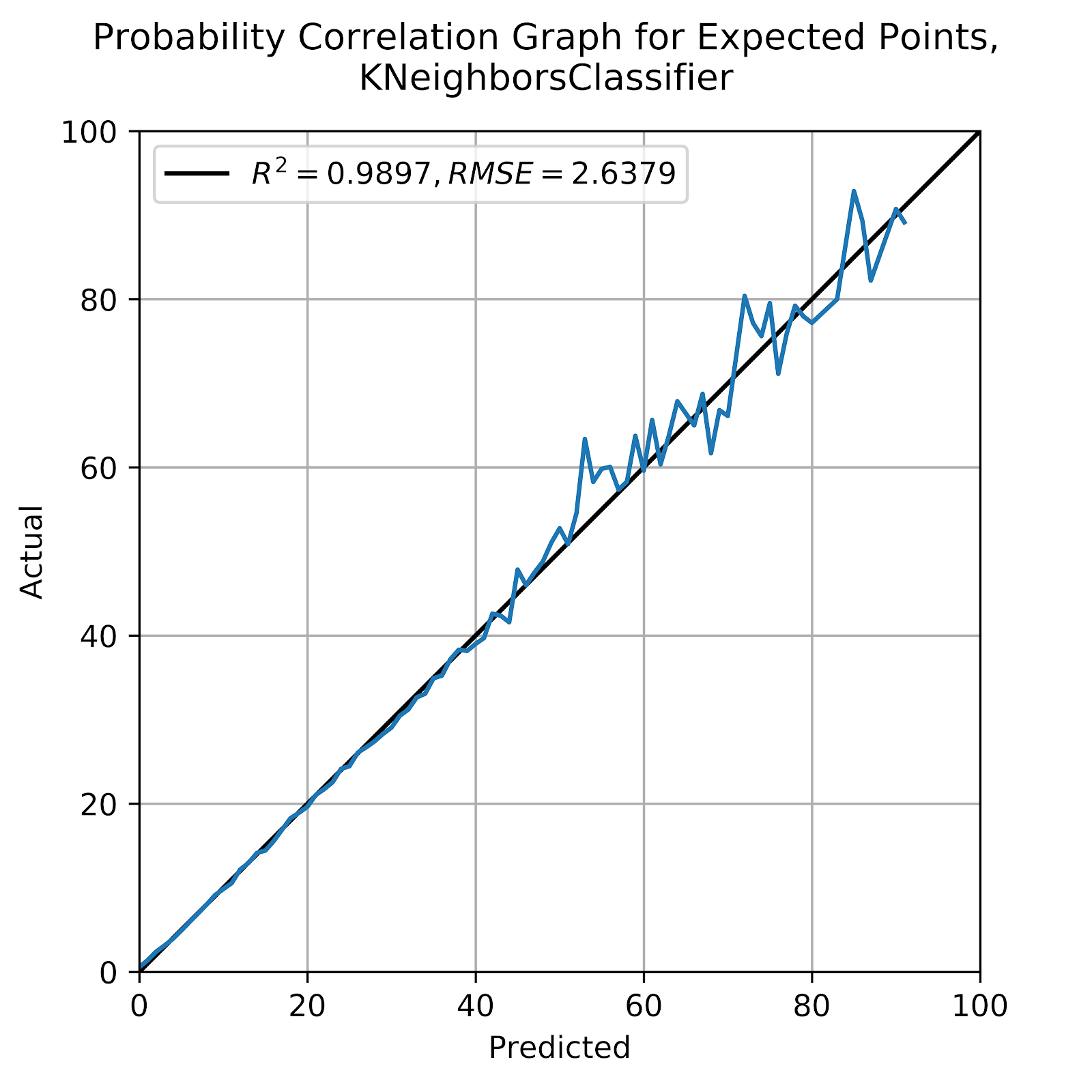
Figure 1 Correlation graph for predicted probabilities, kNN
The correlation graph stops at about 90%, above which there are no points that meet the N=100 threshold to be displayed on the graph. This should not come as a surprise, we can think of few situations where a specific score is near-certain to come next. Certainly no defensive score would ever be this likely, nor would an offensive rouge. And without time remaining as a feature the end of the half would not be this likely. This leaves offensive touchdown, field goal, or safety. A touchdown is most likely when the offense has 1st & goal at the 1-yard line, a fairly common occurrence as the result of penalties in the red zone. P(1D) for this situation, which is equivalent to the probability of ending a drive with a touchdown, is 90% (Clement 2018b) There is some small chance of the drive failing and the resultant score on a future drive being a touchdown for the same offensive team, but this is minor noise in the big picture. A field goal would be most likely on 3rd & goal at a distance that would be too great for most teams to consider going for the touchdown, but close enough that the FG is near-certain. This would occur in the 5-10 yard line area, where again the probability of successfully making this kick is around 90%. Finally, a safety might be intentionally conceded when a team is backed up well within its own end, but as we see in Figure 2 below, this probability never goes much past 50%, as many coaches would prefer to punt from this situation.
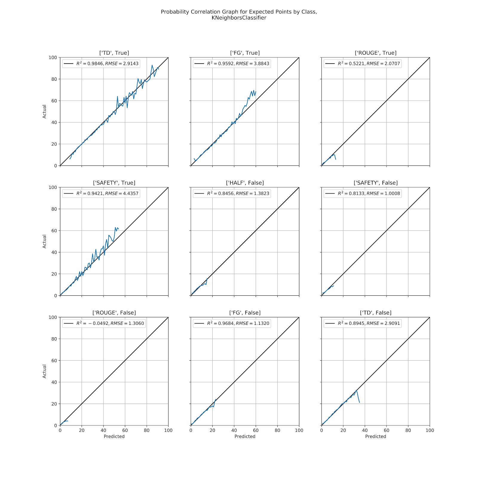
Figure 2 Correlation graph for predicted probabilities by class, kNN
Per prediction the kNN model would perform much better, but it is precisely in those extreme situations when it is most important for a model to retain its validity, and here is where we have concerns about the limitations of the kNN model. Extreme probabilities occur in extreme situations, and those very extreme situations are precisely those where we have already seen the limitations of the kNN model due to the asymmetry of the data surrounding it, and yet these extreme situations are also those with higher leverage, where we most need the model to remain accurate. We see, for example, the model grossly underpredicting the probability of [“FG”, True] above 50%. We also see that field goals are not part of the 90% probability prediction for the kNN model, and that these very high data points in the complete correlation graph in Figure 1 are largely due to offensive touchdowns for everything above 60%.
Normalization of the data would also improve some of the results, especially for [“FG”, True] and [“SAFETY”, True], where down is such a driver of these probabilities, but that normalization is highly problematic because of the non-normality of the distribution of each feature. A linear compression of each feature would then imply that each feature is to be weighted equally over its valid domain, which is an equally dubious statement. Grid-searching the best combination of normalization parameters is possible, but then becomes an exercise in overfitting.
ii. MLP
The MLP models has been locked in battle with the GBC to provide the best model. Both were excellent in providing accurate EP values (Clement 2019a), with R2 values consistently in excess of 0.995. Figure 3 shows the probability graph for the entire MLP model. As with the kNN model in Figure 1 we see excellent correlation below 40% and slowly deteriorating above that where the sample sizes begin to shrink. We see the graph end at a higher probability than with the kNN model, as the MLP model is better able to predict at the extremes than the kNN, for reasons already discussed.
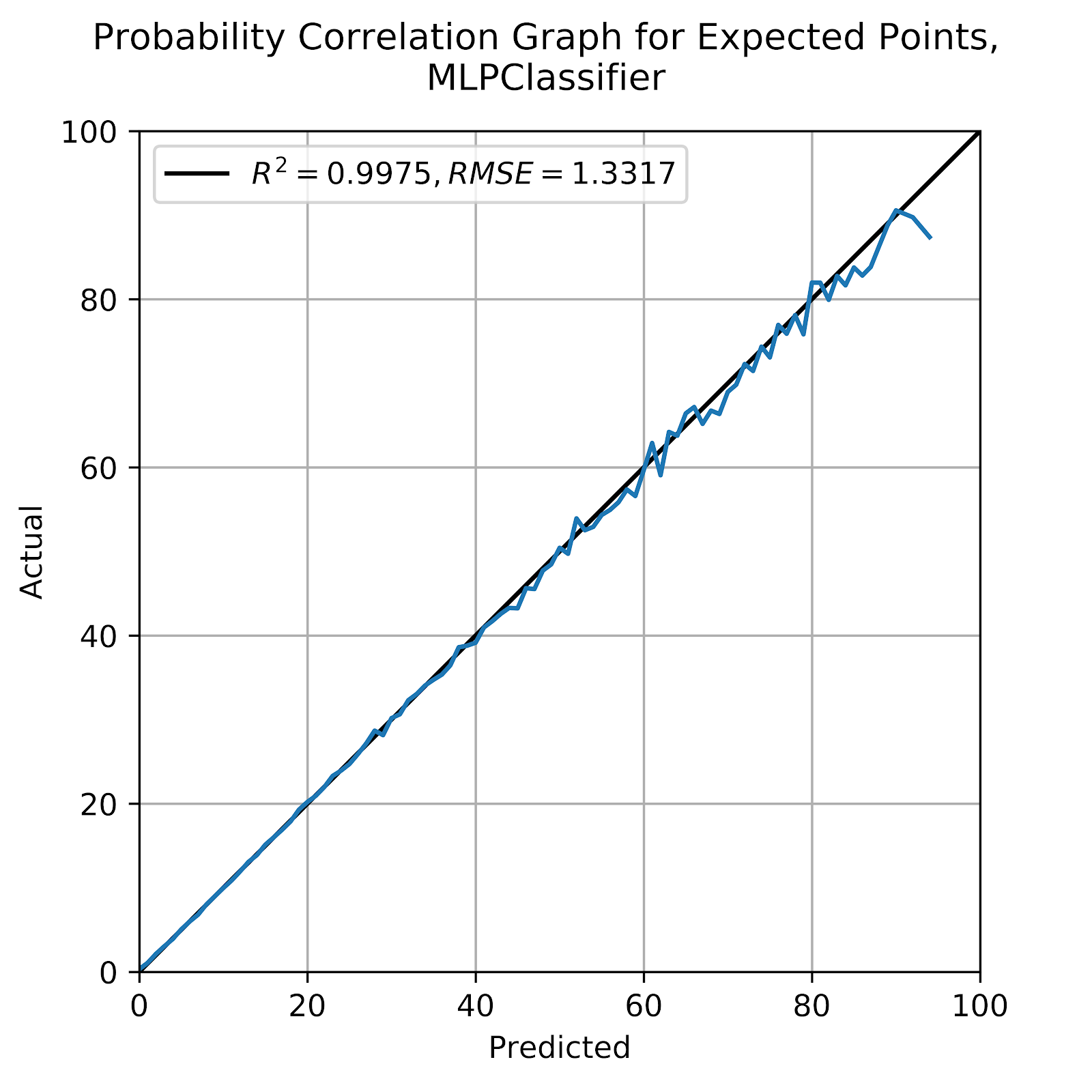
Figure 3 Correlation graph for predicted probabilities, MLP
We also see in Figure 3 that the model, even as the variance grows, shows no discernible bias. In Figure 4 we see each scoring possibility, and we continue to see strong results across the board. Unlike the kNN model we do not see large deteriorations in correlation quality, either by R2 or RMSE, for the less likely scoring plays. We also see significant changes in [“FG”, True], where this model is better able to predict situations where a field goal is very likely, as well as [“SAFETY”, True], instead of relegating it to the lower-left corner.
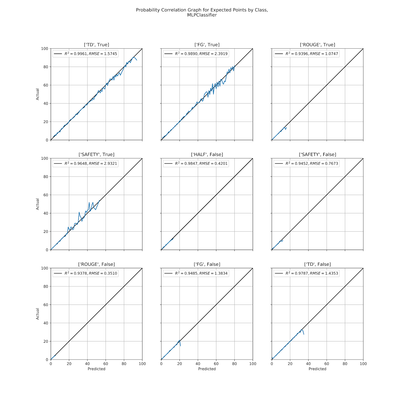
Figure 4 Correlation graph for predicted probabilities by class, MLP
Looking at each correlation graph in Figure 4 none of the graphs has a visible bias, an encouraging sign that the model is well-calibrated. On both [“TD”, False] and [“FG”, False] we do see a drop into underprediction at the very end, and we even see this for [“TD”, True], and very faintly for a few others. Whether it is meaningful or simply noise is difficult to discern at this point, but it should be considered when looking at the models along different axes.
iii. GBC
The GBC model has consistently been the best performer, and here has bested the MLP along every R2 measure in Tables 2 and 3, while having the better RMSE in most of those cases. In Figure 5 we see the correlation graph for the MLP model in its entirety.
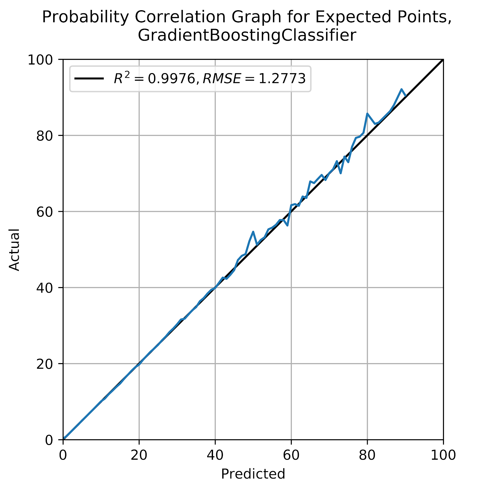
Figure 5 Correlation graph for predicted probabilities, GBC
Figure 5, with good correlation, also shows no visible bias, and a good range of values, much like the MLP. The only disadvantage to the GBC relative to the MLP is the long fit times, especially when using k-fold cross-validation, where the warm_start option for the MLP allows for much faster fit times by allowing the model to start where it left off and go immediately to fine-tuning, whereas the GBC model’s warm_start cannot be used in this way.
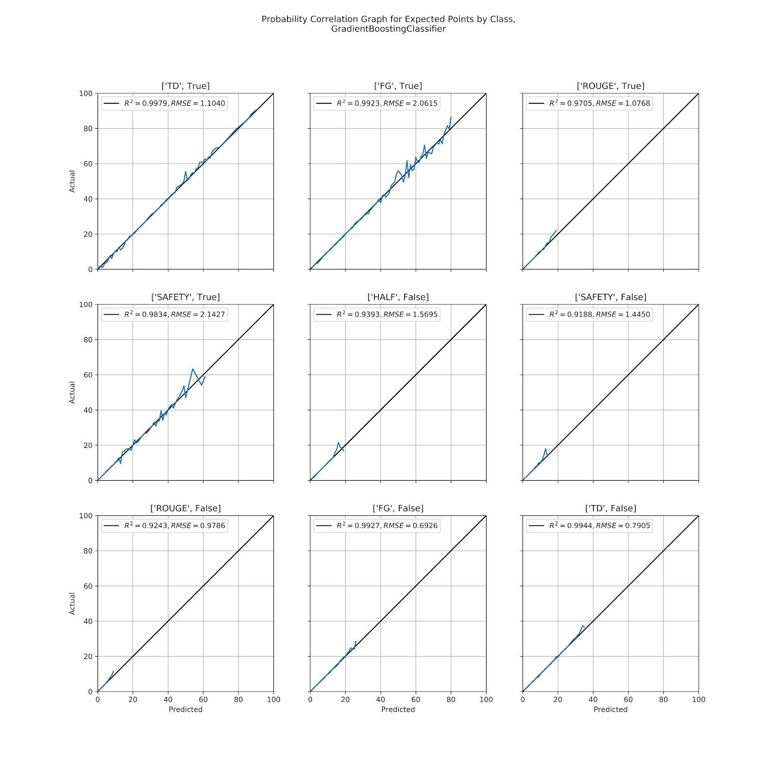
Figure 6 Correlation graph for predicted probabilities by class, GBC
Unlike the drop-off seen from the MLP model in Figure 4 for many of the scoring possibilities, the GBC instead shows an “up-down” spike in Figure 6 for several, including [“TD”, False], [“SAFETY”, False], [“HALF”, False], and [“SAFETY”, True].
b. By Quarter
To look for problems in the model we can look at the correlation graphs split out by various dimensions to identify consistent biases, as we have done consistently in prior works (Clement 2019a, [a] 2020, [b] 2019). We use down as a way of splitting out the data along an axis that is both significant to the game, and therefore likely to show biases, and it is not a feature in the model, so the model is unaware of it. Dividing the model along multiple axes, some of which are and some which are not features, gives us different angles to examine the model’s performance based on what the model does or does not know beforehand. Table 4 gives the correlation coefficients of each model according to down.
Table 4 Correlation coefficients for probabilities by quarter
In Table 4 we see some expected results, such as every model’s worst quarter being the 4th quarter. This happens when Win Probability (WP) considerations overtake EP considerations late in the game. But we also see some unusual results, such as the kNN model providing the best 4th quarter performance of all three models, and in every quarter being neck-and-neck with the other models.
i. kNN
While the kNN model showed some issues when looking at individual class probabilities, its coefficients in Table 4 stood proud with two models known to be very strong. In Figure 7 we look at kNN by quarter. We see a fair bit more noise, especially at higher predicted probabilities, but more interestingly is that each of the first three quarters is slightly underpredicted, and then the 4th quarter is quite a bit overpredicted. By symmetry these would average out. Undeprediction in the 4th quarter is typical of EP models (Clement 2018a) as teams that are leading will look to run out the clock, and teams trailing will make decisions to maximize WP, sometimes at the expense of EP.

Figure 7 Correlation graph for probabilities by quarter, kNN
Figure 7 stands as a perfect example of why EP must either incorporate some sort of game time feature or only be used in situations where EP and WP are concordant, that being generally the first three quarters when the score is still close. There is no exact demarcation of this; in principle teams should always aim to maximize WP, but EP is a valid proxy in most situations, and one that can provide both better accuracy and precision, whereas WP can be unstable in the early part of the game.
ii. MLP
When looking at the three models by quarter the distinctions between the performances of each model become very subtle. When we look at the performance of the MLP by quarter in Figure 8 we see basically the same thing as for the kNN in Figure 7, the model underpredicts in the first three quarters and then significantly overpredicts in the 4th quarter. It is also well-calibrated and stable below 50% predicted probability, becoming noisier beyond that. With correlation coefficients better than the kNN but not enormously so; separating the model results by quarter is useful way to look for potential biases, but is unable to differentiate between these three models. This is unsurprising, as these models were already selected for being well-calibrated.

Figure 8 Correlation graph for probabilities by quarter, MLP
iii. GBC
The GBC model in Figure 9 leads us to the same conclusion as the other two models in Figures 7 and 8. But when we look at all the models together with an eye to their similarities instead of their differences, there is one thing that stands out. At about 10% probability there is a downward spike for each of the first three quarters and then a sharp upward spike in the 4th quarter. This low-probability event is happening with disproportionate frequency in the 4th quarter. This is a good opportunity for further investigation into why this is happening, perhaps the subject of another work. A working hypothesis is that this is an instance of [“HALF”, False]. In the first three quarters there are enough scoring plays that few plays lead to the end of the half with no intervening scoring, but in the fourth quarter there are many situations in blowout games where both teams will play out the string with no intention of scoring, both teams content to let the game end as it stands. This is a recurring data point on all three models, so it is unlikely to be a random variation, and it merits looking into.
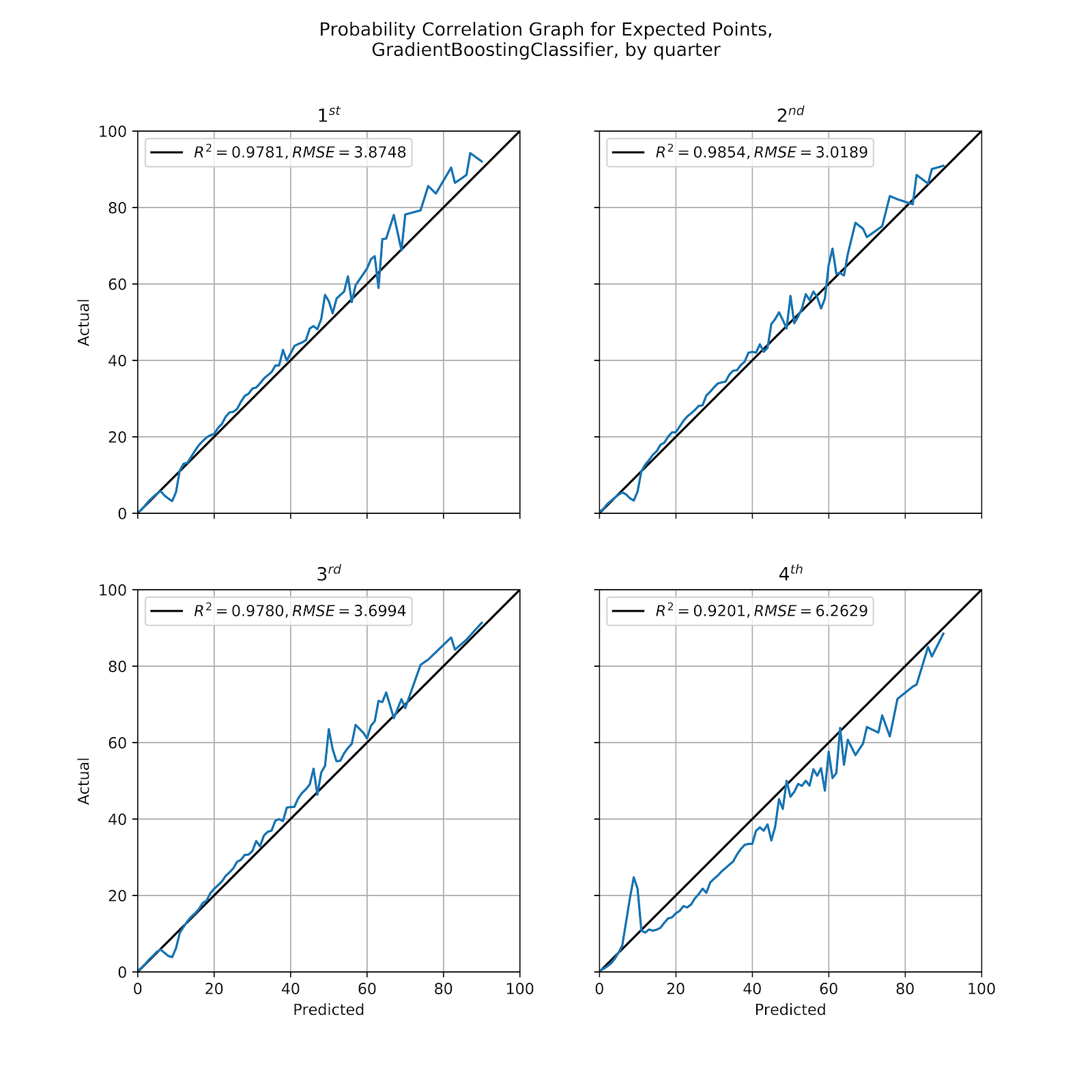
Figure 9 Correlation graph for probabilities by quarter, GBC
c. By Down
As opposed to splitting the model results by quarter, which is not a feature in these models, when we look at our results by down we are looking along one of the dimensions of our model. This is especially important when looking at down because down should properly be considered a categorical model, but for technical limitations is left as a continuous model in sklearn. The GBC model’s nature gives the desired effect of treating down as an ordinal variable, but kNN and MLP do not, they simply treat it as a continuous numerical variable. This is not the preferred behaviour, but the results have been consistently good for these models. Still, an abundance of prudence dictate that we examine these models more closely at precisely the point that we expect to be most problematic. In Table 5 are the correlation coefficients for each model, split up by down.
Table 5 Correlation coefficients for probabilities by down
Unlike Table 4 where the models were split up by quarter, the kNN model suddenly looks much worse when separated by down, especially with increasing down. The MLP performs very well here, but not quite as well as the GBC, which continues to be the strongest all-around model.
i. kNN
One of the anticipated problems for the kNN model is in how it handles down as a variable. Not only does the models fail to grasp the notion of ordinal variables, but because the data is not normalized it treats the difference of a single down as being equivalent to a single yard of field position or distance to gain. We can expect the model to struggle in this section because of this, since a difference of a single down is far more impactful than a single yard. In Figure 10 we can see the correlation graphs for kNN by down.
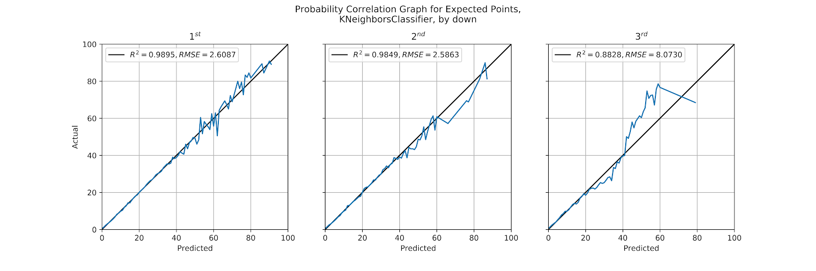
Figure 10 Correlation graph for predicted probabilities by down, kNN
In an unsurprising result, we do see the best results on 1st down, where the correlation is very strong, with perhaps a slight underprediction bias at the upper end, but small enough to perhaps be dismissed as mere variance. 2nd down is relatively strong, though it overpredicts some if its higher probabilities, likely the influence of neighbouring 1st down plays.
On 3rd down, however, the model goes to pot. It massively underpredicts nearly everything above 40%, which we presume to be the area of field goals. 3rd downs are both less common than 2nd and especially 1st down plays, but their distance to gain also has greater deviation than the other downs, leading to the model becoming more “contaminated” by data from other downs whose influence has not been appropriately tempered. In short, the probabilities put out by the kNN model on 3rd down are simply not to be trusted.
ii. MLP
MLP should struggle with properly accounting for down, as it must treat the input as truly continuous, but when we look at Figure 11 we do not see the expected issues, in fact the 3rd down graph is as good as the 1st down graph was for kNN in Figure 10. Although the variance increases we avoid any signs of bias in the model. Because of the large number of hidden nodes the model is better able to capture the nuances of different downs and return an accurate model.

Figure 11 Correlation graph for predicted probabilities by down, MLP
iii. GBC
The GBC returned strong coefficients in Table 5, and a glance at Figure 12 shows that the model is impeccably well-correlated, with 1st down being almost perfect, and 2nd down not far behind. Even on 3rd down the model is as well-calibrated as kNN and MLP are on 1st down. This is a strong showing for the GBC as we look for the MLP and GBC to distinguish themselves.
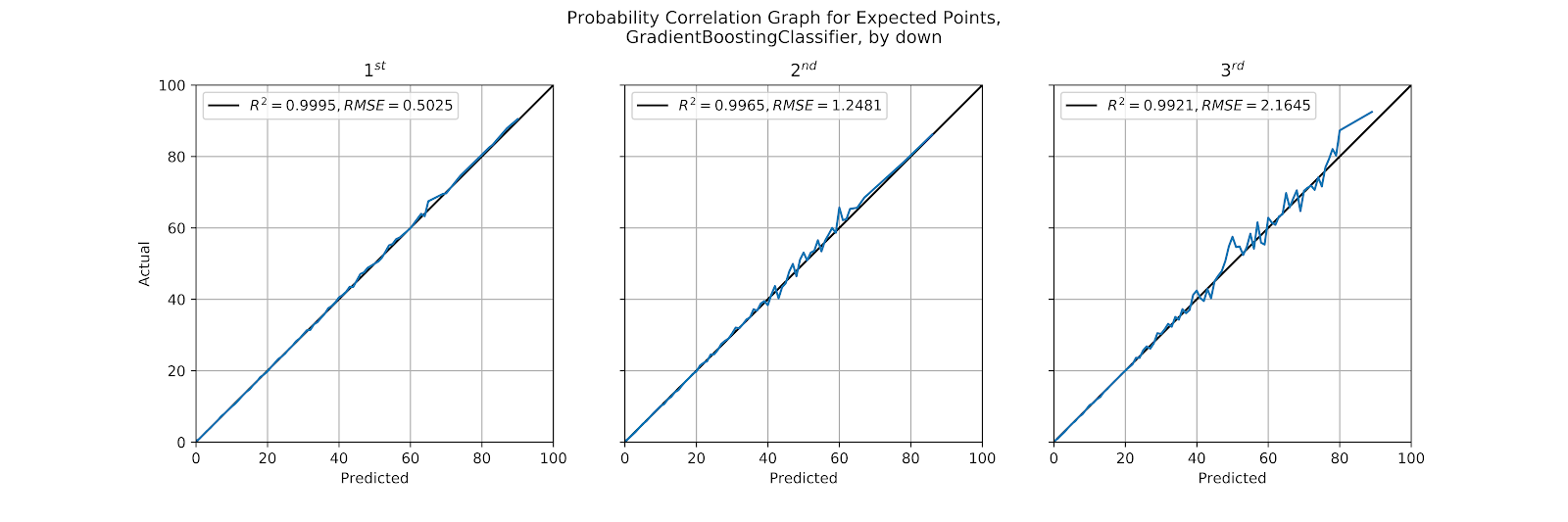
Figure 12 Correlation graph for predicted probabilities by down, GBC
d. By Home-Away
When looking at models by home and away we are very much looking to find inherent biases in the data. The notion of home-field advantage in sports is well-known (Vergin and Sosik 1999; Jamieson 2010), and since the model has no knowledge of which is the home team, we should see that ignorance reflected as a bias in the results. To wit, we expect a general overprediction for the away team and an undeprediction for the home team. In Table 6 we can see the correlation coefficients by model, but we do not necessarily want perfect correlation. Since we are correlating the predicted probabilities of all scoring outcomes, however, an underprediction of EP for the home team and vice versa will not necessarily materialize itself as a globalized underprediction of all scoring probabilities, as an equal number of predictions are for the defensive team scoring. The defensive scores will always have a fairly low predicted probability, but these are somewhat confounded because many of the offensive scores will have predicted probabilities well below 50%. Instead we can only look at the higher predicted probabilities, which are the exclusive domain of offensive scoring plays in specific situations.
Table 6 Correlation coefficients for probabilities by home-away
i. kNN
The kNN model’s correlation graph is shown in Figure 13. For the away graph we do not see the expected bias, and in fact this is one of the best-calibrated graphs we have seen thus far from the kNN. If one were to squint very closely at the model there might be an underpredicted region between 25 and 45%, before the graph becomes too noisy and indistinct. For the home graph there is a similar pattern between 40 and 60% where it is weakly underpredicted, but the graphs for predicted probabilities show this bias far less distinctly than when looking at EP values (Clement 2019a, [a] 2020).
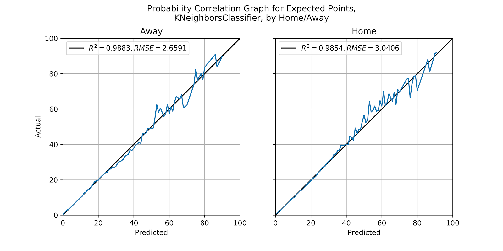
Figure 13 Correlation graph for probabilities by quarter, kNN
ii. MLP
As the MLP model is overall better calibrated than the kNN, we hope to more clearly see the expected bias in Figure 14, and we are not disappointed. The result is subtle but visible, especially on the away side, where the model is consistently underpredicted above 25%. On the home side the underprediction is even more subtle, nigh-invisible.

Figure 14 Correlation graph for probabilities by quarter, MLP
iii. GBC
The final examination in this work looks at the GBC broken down by home and away, as seen in Figure 15. Contrary to the MLP in Figure 14 we can clearly see the underprediction of the GBC for the home team, but we cannot see, or at least what we see is very subtle, any overprediction for the away team. As far as the prediction of class probabilities is concerned home and away is a very small source of bias, although an accumulation of small errors can lead to large errors in the predicted EP value because the mapped values are the inverse of one another.

Figure 15 Correlation graph for predicted probabilities by quarter, GBC
5. Conclusion
The three models that accurately predicted EP values also showed themselves capable of predicting EP class probabilities. While the EP values are derived from these probabilities it was unknown whether the individual class probabilities would be well-calibrated, or whether the accuracy of the EP prediction was driven only by a few major classes, with the others serving as minor noise. This affirms the added value of using a classification model over a regression model, as we can see that the predicted EP values are better (Clement 2019a, [a] 2020), and the underlying class predictions are also useful.
A more formals comparison of categorical and regression models is in order to put to bed the question of the utility of the much slower-fitting classification models. Another area of focus should look at the selection of additional features, such as home-field, and time remaining, to suss out the largest sources of error in the models.
EP is the most valuable family of models in football analytics, as it sits at the intersection of utility and generality. It is usable in almost all game situations, and highly precise, as well as being interpretable. This interpretability is important to communicate to non-technical personnel the added value of a quantitative approach to decision-making. The continued development of EP in Canadian football is an area ripe for rapid development.
6. References
Clement, Christopher M. 2018a. “Score, Score, Score Some More: Expected Points in American Football.” Passes & Patterns. June 5, 2018. http://passesandpatterns.blogspot.com/2018/06/score-score-score-some-more-expected.html.
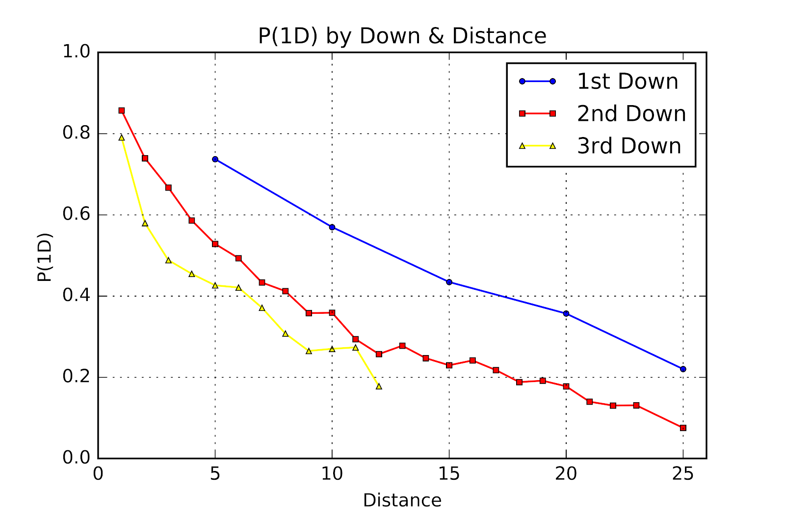
———. 2018b. “Three Downs Away: P(1D) In U Sports Football.” Passes & Patterns. August 23, 2018. http://passesandpatterns.blogspot.com/2018/08/three-downs-away-p1d-in-u-sports.html.
———. 2019a. “It’s Spelt ‘Rouge:’ Expected Points in U Sports.” Passes & Patterns. February 21, 2019. https://passesandpatterns.blogspot.com/2019/02/its-spelt-rouge-expected-points-in-u_21.html.
———. 2019b. “It’s Up and It’s Good: Field Goals in U Sports.” Passes & Patterns. July 19, 2019. https://passesandpatterns.blogspot.com/2019/07/its-up-and-its-good-field-goals-in-u.html.
———. 2020a. “Reverting to the Mean: Regression EP Models in U Sports Football.” Passes & Patterns. January 1, 2020. https://passesandpatterns.blogspot.com/2020/01/reverting-to-mean-regression-ep-models.html.
———. 2020b. “Fresh Start: 2019 Play-by-Play Data in the Passes & Patterns Database.” Passes & Patterns. January 6, 2020. https://passesandpatterns.blogspot.com/2020/01/fresh-start-2019-play-by-play-data-in.html.


No comments:
Post a Comment